15+ Fonts That Feel Like Logos: The Designer's Guide to Typography (2026)
- Tips & Tricks,
- 12 minutes to read
Not all fonts are created equal when it comes to logo design. While some typefaces work beautifully for body text or headlines, only a select few have that special "logo DNA" that makes brands instantly memorable and trustworthy. This guide reveals 15 carefully curated fonts that consistently deliver professional, distinctive logos—from contemporary geometric powerhouses to boutique foundry gems that will set your brand apart from the competition.
You're staring at a blank canvas, client breathing down your neck, deadline looming. The logo needs to feel instantly recognizable, like it's been around forever. But here's the thing—most designers reach for the same tired fonts, creating logos that blend into the digital noise.
What if I told you there are fonts that practically scream "logo material" from the moment you see them?
I've spent years building design tools and studying what makes visual designs stick. We've already covered the best fonts for web and apps, but logo typography is a completely different beast. After analyzing thousands of successful brands and working with designers worldwide, I've discovered something fascinating: the best logo fonts aren't just pretty typefaces—they're fonts with built-in personality that feels authentic and timeless.
Here's what the research tells us: well-designed logos can boost brand recognition by up to 80%, according to comprehensive industry research on visual branding effectiveness. Even more striking? Harvard Business Review's study of 597 logos shows that logo design characteristics significantly affect consumers' ability to recognize and trust brands, making logos the single most identifiable brand element.
But here's where most designers get stuck. With thousands of fonts available, how do you know which ones have that special "logo DNA"? Let me show you exactly what to look for and share the 20 fonts that consistently deliver that coveted logo feel.
What Makes a Font Feel Like a Logo?
Before we dive into specific fonts, let's crack the code. Not every beautiful typeface makes a great logo font. After years of design work, I've identified five key characteristics that separate logo-worthy fonts from the rest:
Strong personality without overwhelming neutrality. The best logo fonts strike a perfect balance—they're distinctive enough to be memorable but not so quirky that they distract from your message.
Geometric precision. Clean lines and consistent proportions are non-negotiable. Your logo needs to work perfectly whether it's on a business card or a billboard.
Versatility across mediums. A true logo font performs beautifully in digital interfaces, on printed materials, and even when embroidered on merchandise.
Memorability factor. The best logo fonts have unique letterforms that stick in minds. It's not about being flashy—it's about having subtle details that make people remember your brand.
Brand-ready balance. Professional yet approachable, modern yet timeless. Logo fonts need to feel credible enough for corporate presentations but friendly enough for everyday interactions.
The 15+ Best Fonts That Feel Like Logos
I’ve handpicked these 15+ fonts to help you zero in on exactly what your brand needs—whether you’re aiming for tech-forward minimalism, boutique elegance, or something with a bit of playful personality. Each font on this list has earned its place by proving itself in real-world branding projects, from bold startup launches to established global campaigns.
1. Geist
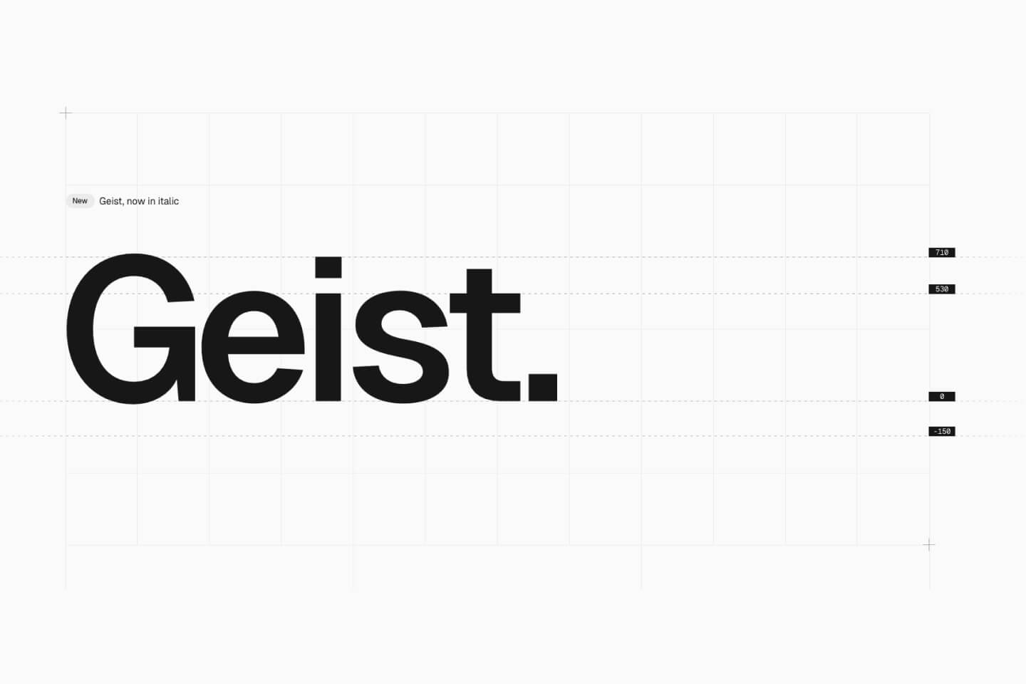
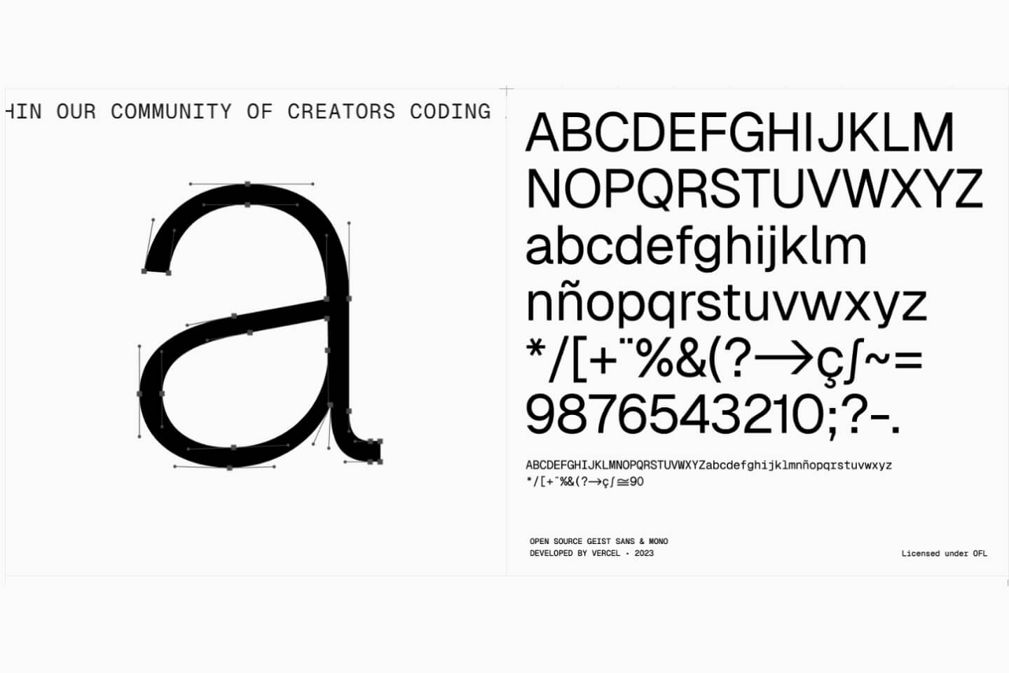
Vercel's contribution to typography brings that perfect balance of tech-forward precision and human readability. Geist was designed specifically for user interfaces but scales beautifully for logo applications. It has that rare quality of feeling both authoritative and approachable—exactly what modern brands need. The letterforms are meticulously crafted for clarity at all sizes, with subtle details that make it memorable without being distracting.
2. Clash Grotesk
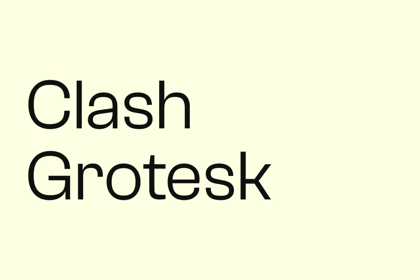
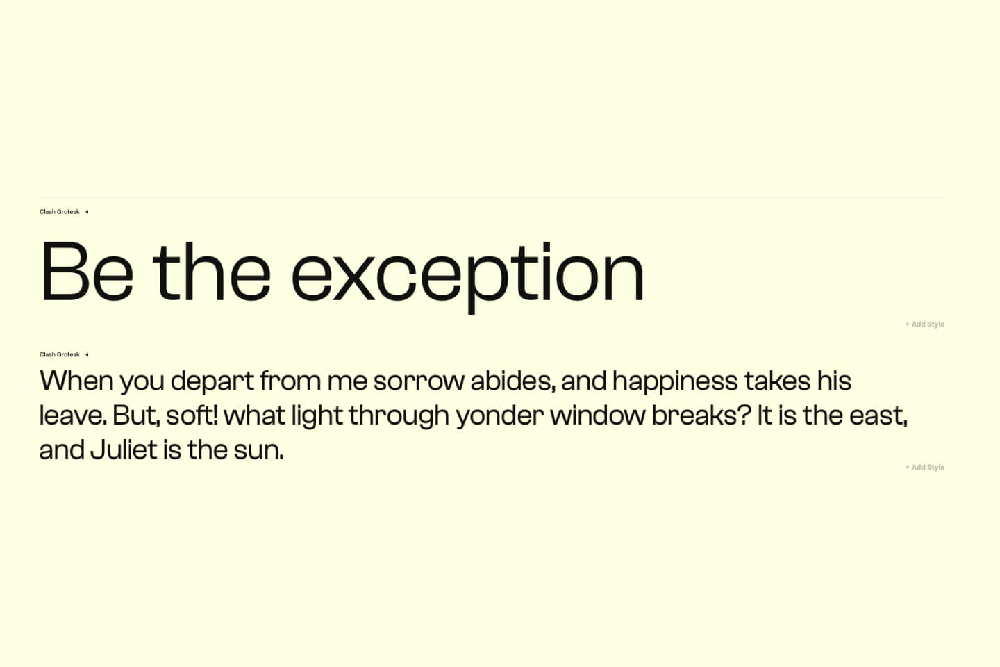
This font has taken the design world by storm in 2024. Clash Grotesk combines geometric logic with just enough personality to make logos instantly memorable. The unique apertures—those small openings in letters like 'a' and 'e'—create a distinctive look that's impossible to confuse with other fonts. The closed apertures give it a contemporary, almost futuristic feel while maintaining excellent readability.
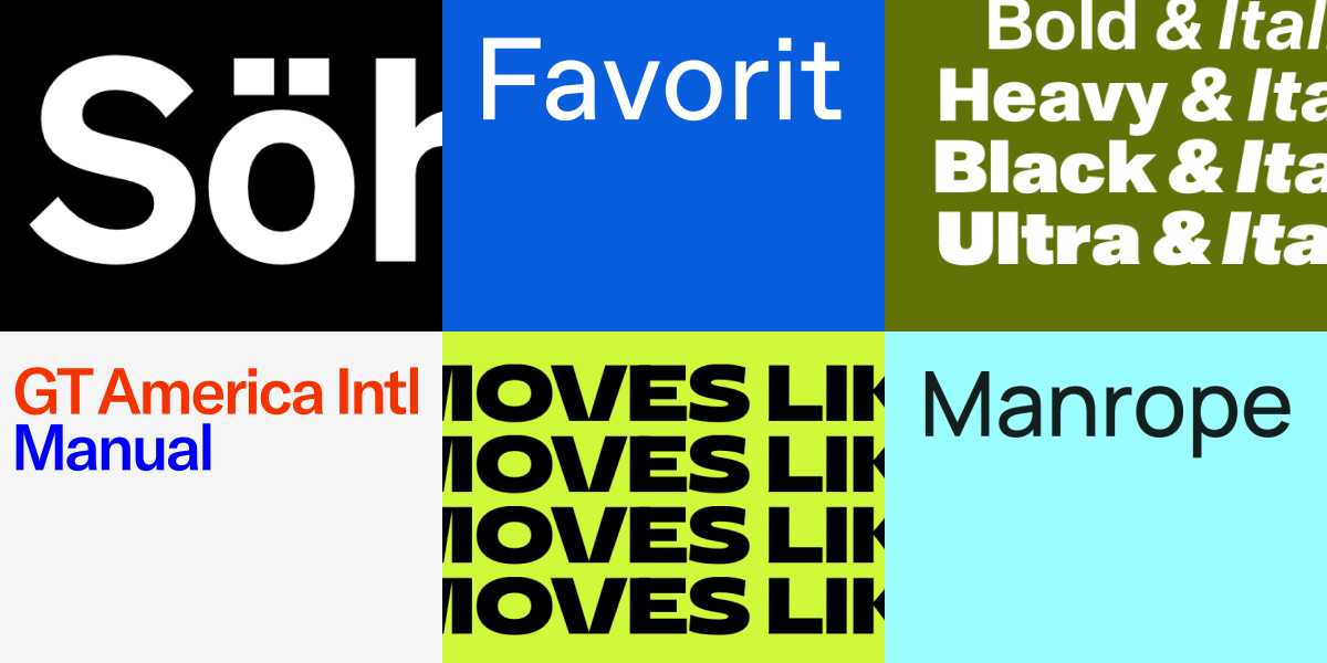
3. GT America
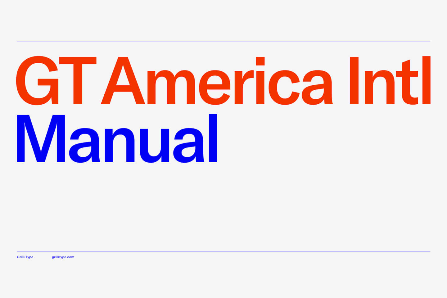
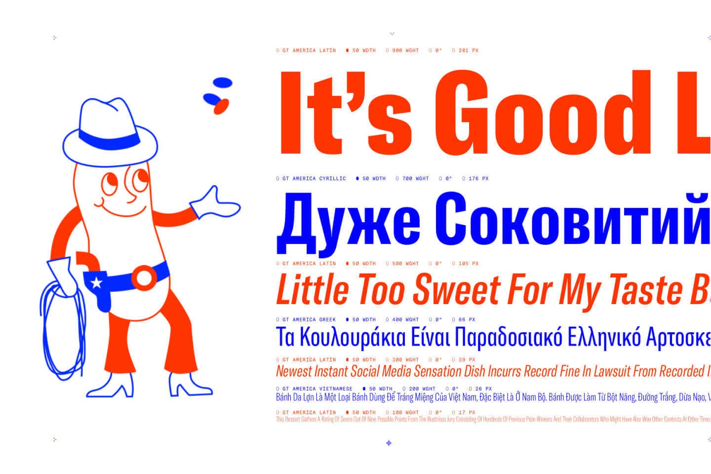
Grilli Type's masterpiece unites Swiss precision with American optimism. GT America has that rare quality of feeling both familiar and fresh—it's grounded in grotesque tradition but with contemporary refinements that make it perfect for modern branding. The character shapes strike the perfect balance between geometric structure and human warmth.
4. Satoshi
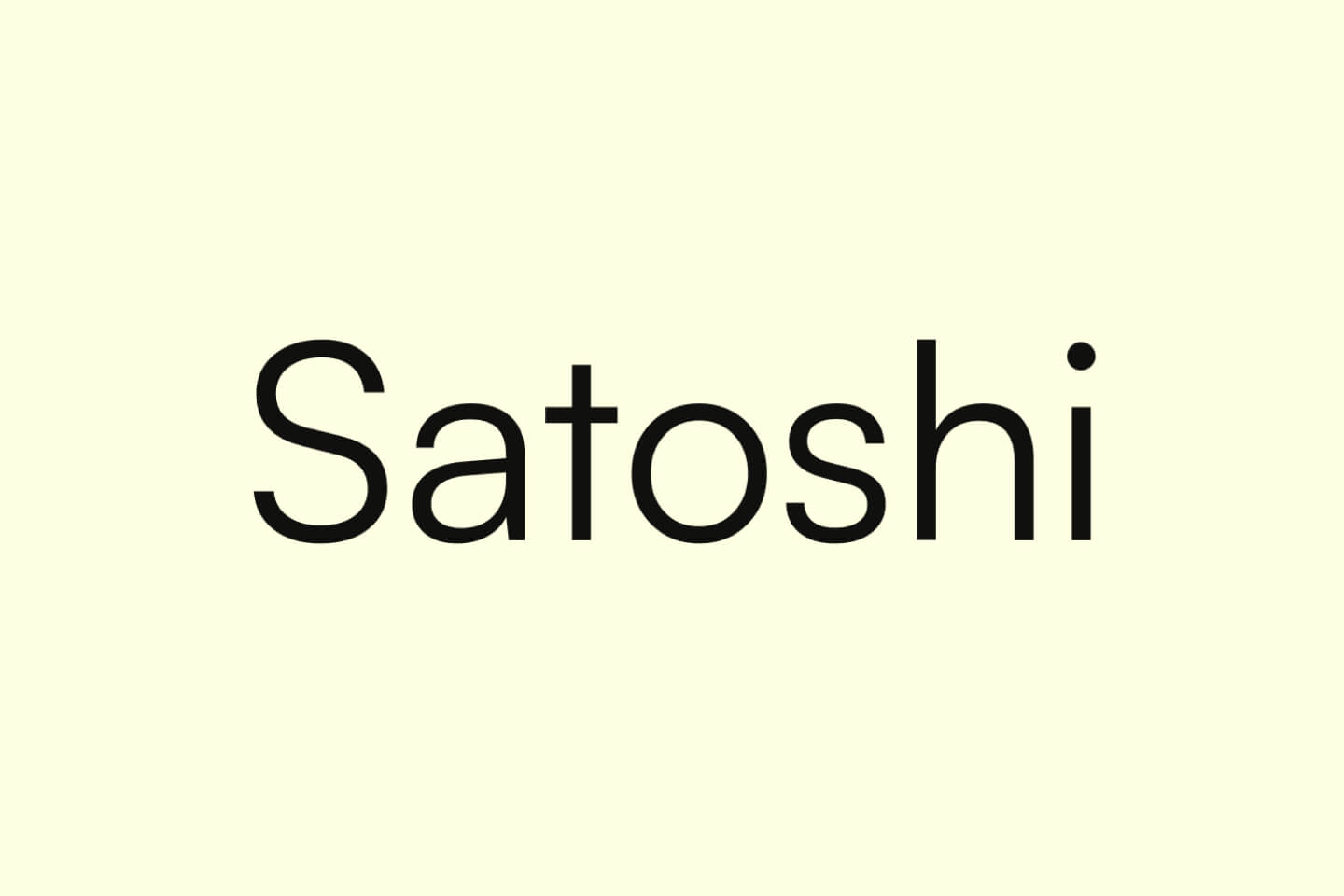
Satoshi has become the secret weapon of indie designers who want professional results without premium licensing costs. It combines geometric structure with rounded warmth, creating a font that feels both precise and approachable. The rounded terminals soften the geometric structure just enough to make it feel friendly and accessible without sacrificing professionalism.
5. Fixel
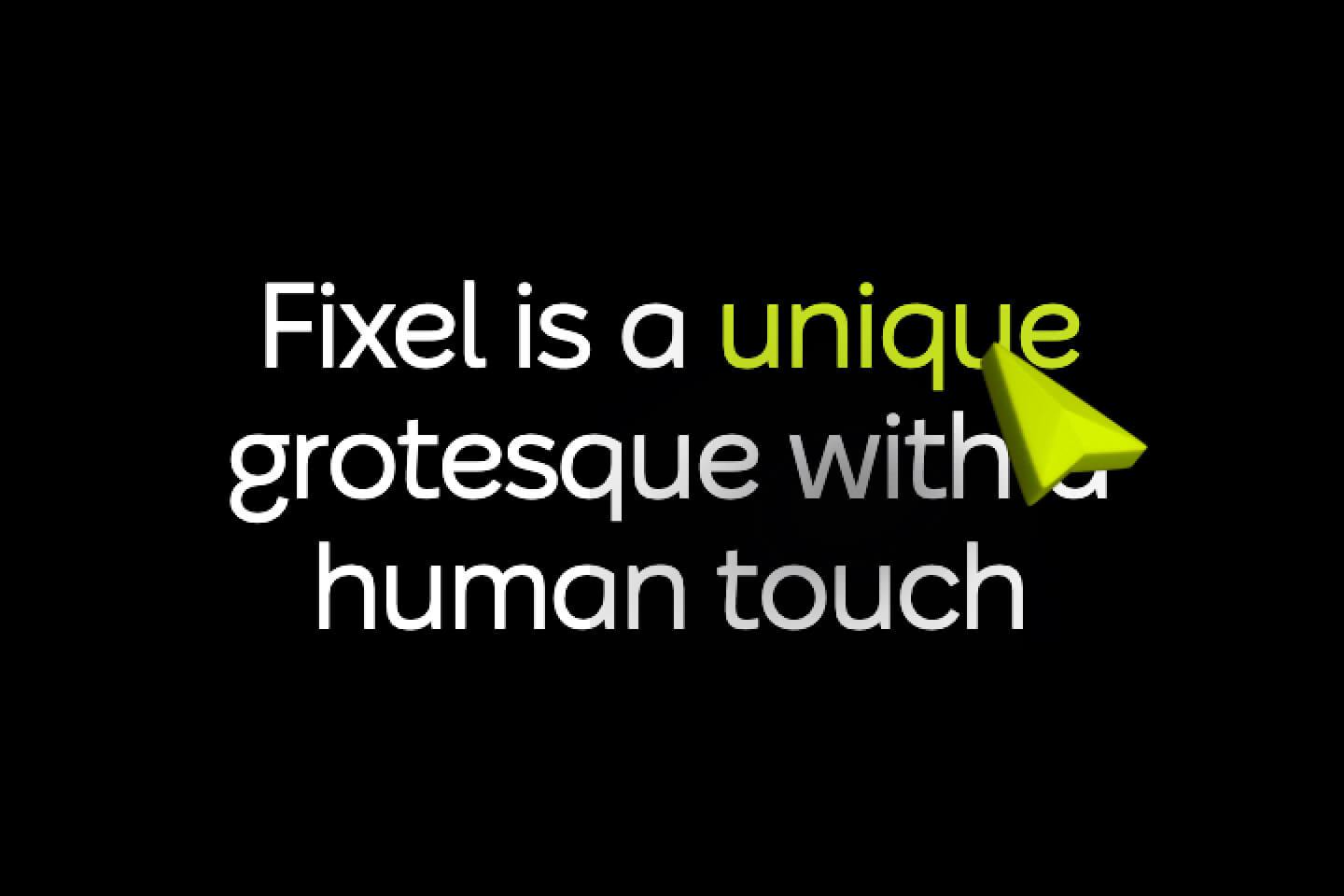
MacPaw's open-source contribution brings clean, geometric precision with subtle personality touches. Fixel was designed for both digital interfaces and print applications, making it incredibly versatile for scalable branding. The geometric structure is clean and modern, with careful attention to spacing and proportions that make it work beautifully at any size.
6. Open Sauce
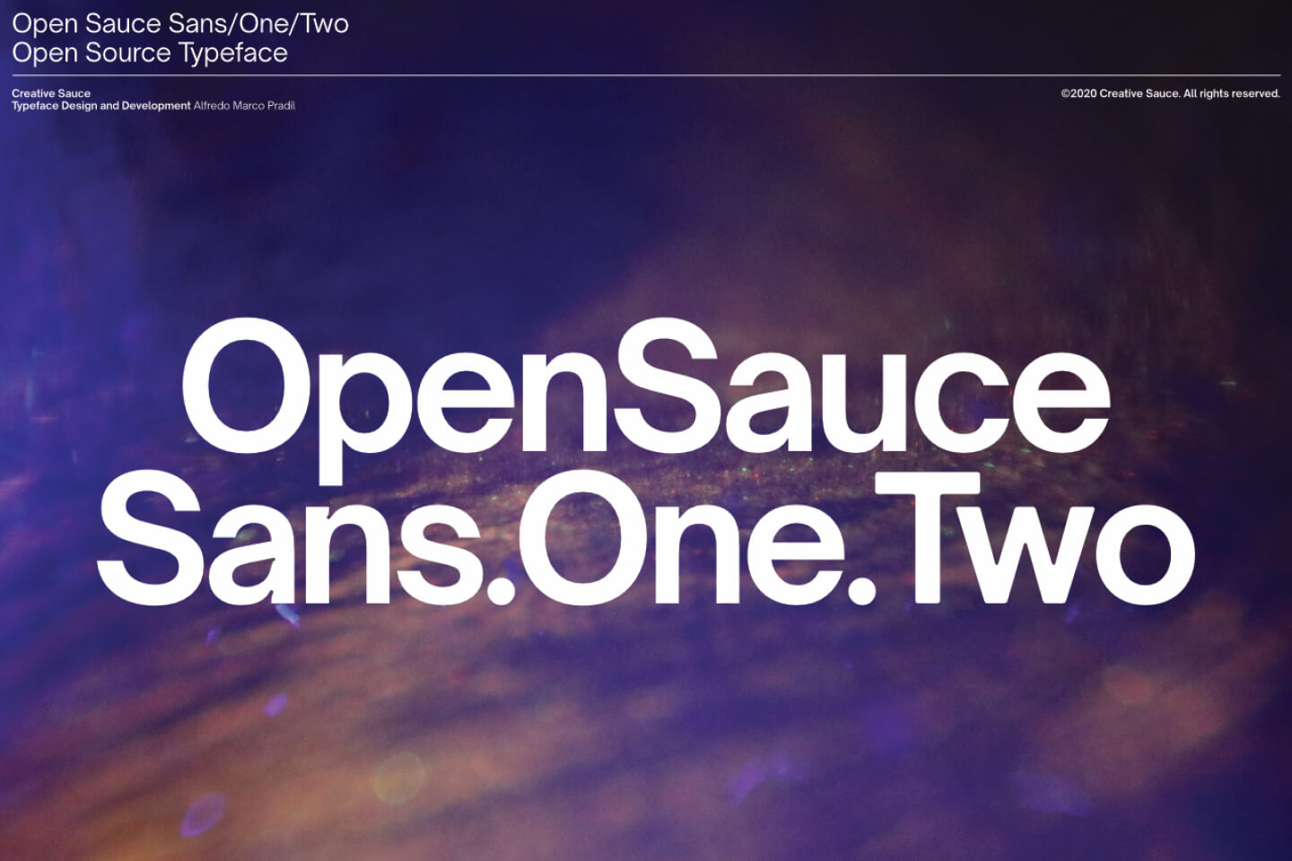
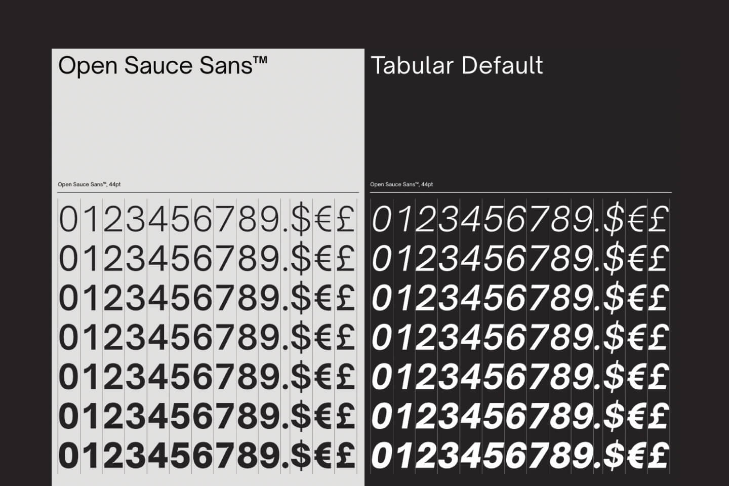
This is the font that's quietly becoming the choice of designers who want something fresher than the usual suspects. Open Sauce offers that perfect contemporary feel—friendly and modern without being trendy. The character shapes are meticulously crafted with subtle personality touches. The letter spacing and proportions are perfectly calibrated for both logo applications and interface use, making it incredibly versatile for brand systems.
7. Instrument Serif
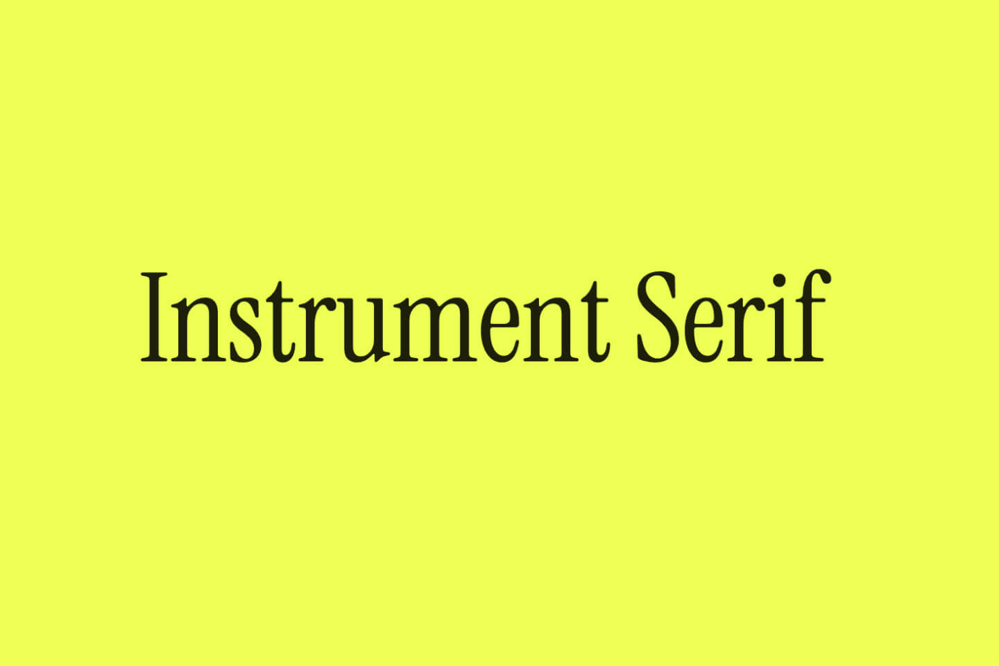
When you need serif authority with contemporary edge, Instrument Serif delivers. This sharp, editorial serif stands out with crisp details and a modern classic vibe that's much less common than ubiquitous serifs like Times or Georgia. The character shapes have that editorial sharpness that makes logos feel instantly credible and sophisticated.
8. Manrope
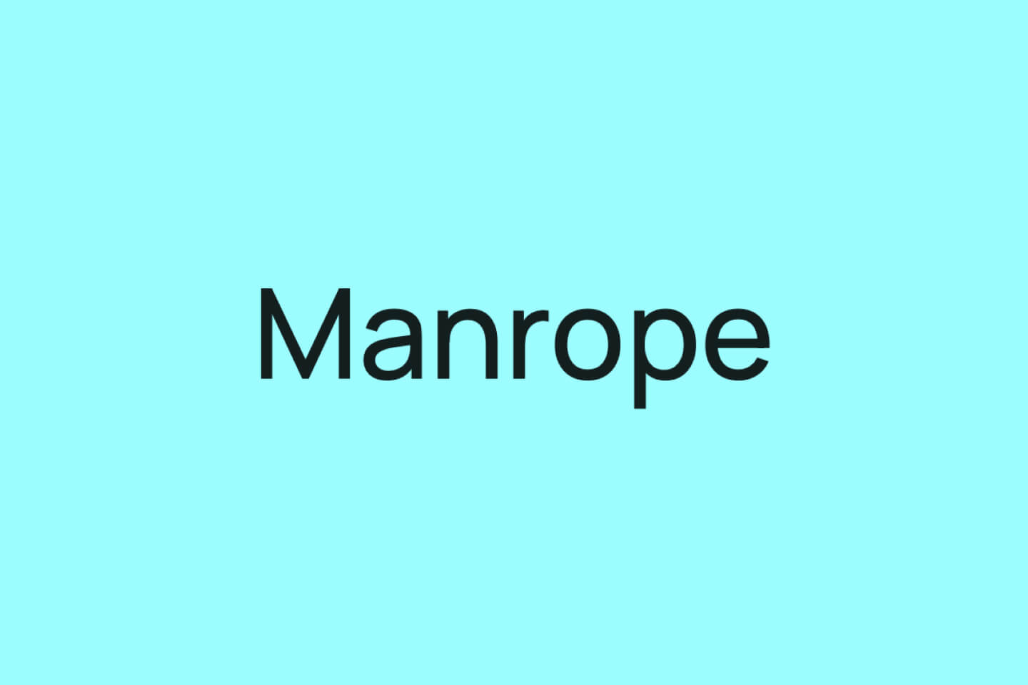
Manrope's semi-geometric structure and distinctive wide letterforms create logos with real impact. It's gaining popularity in digital spaces but hasn't yet translated to widespread logo overuse, making it a smart choice for brands wanting to feel current but not generic. The wide character forms and open apertures make it incredibly readable while maintaining strong personality.
9. Untitled Sans
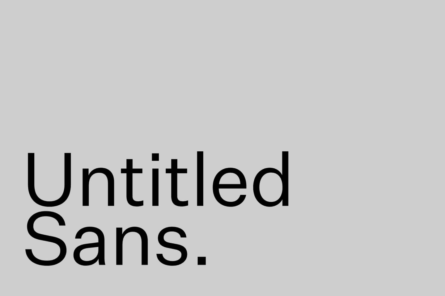
Klim Type Foundry's Untitled Sans represents minimal perfection. It's highly legible and impeccably crafted—the kind of font that makes logos feel effortlessly sophisticated. When you want subtle authority and clarity without any unnecessary flourishes. The minimal approach and pristine letterforms make it perfect for brands that want to project quiet confidence.
10. Basis Grotesque
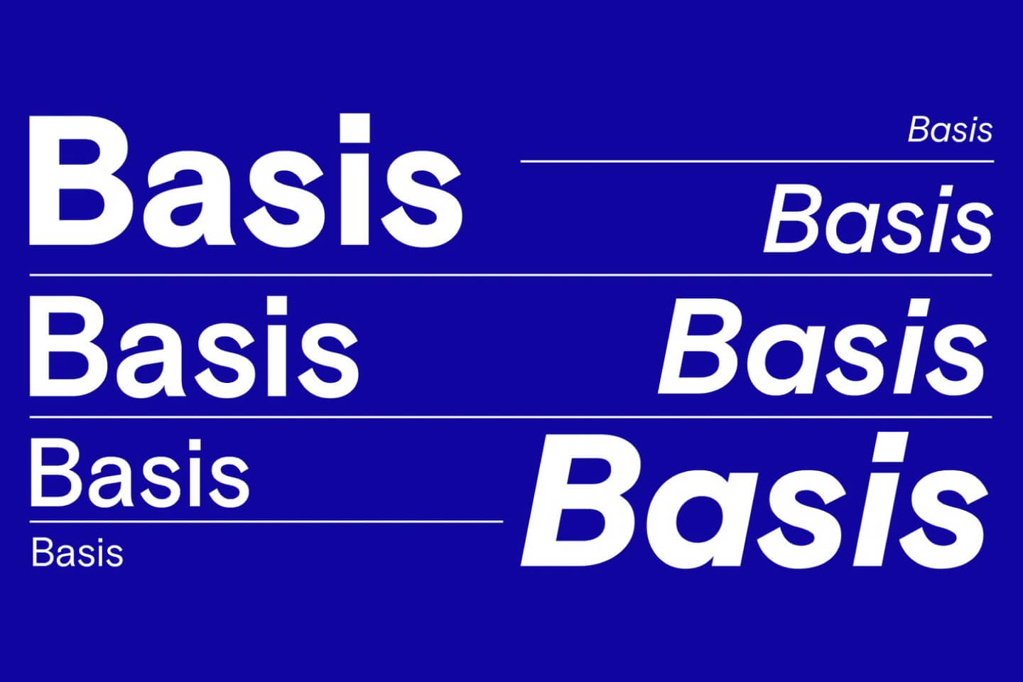
Colophon Foundry's contemporary take on the grotesque genre brings warmth to geometric precision. It's popular among forward-thinking startups and brands that value both clarity and character. The subtle humanist touches prevent it from feeling cold. The character shapes strike the perfect balance between geometric logic and human warmth.
11. Asgard
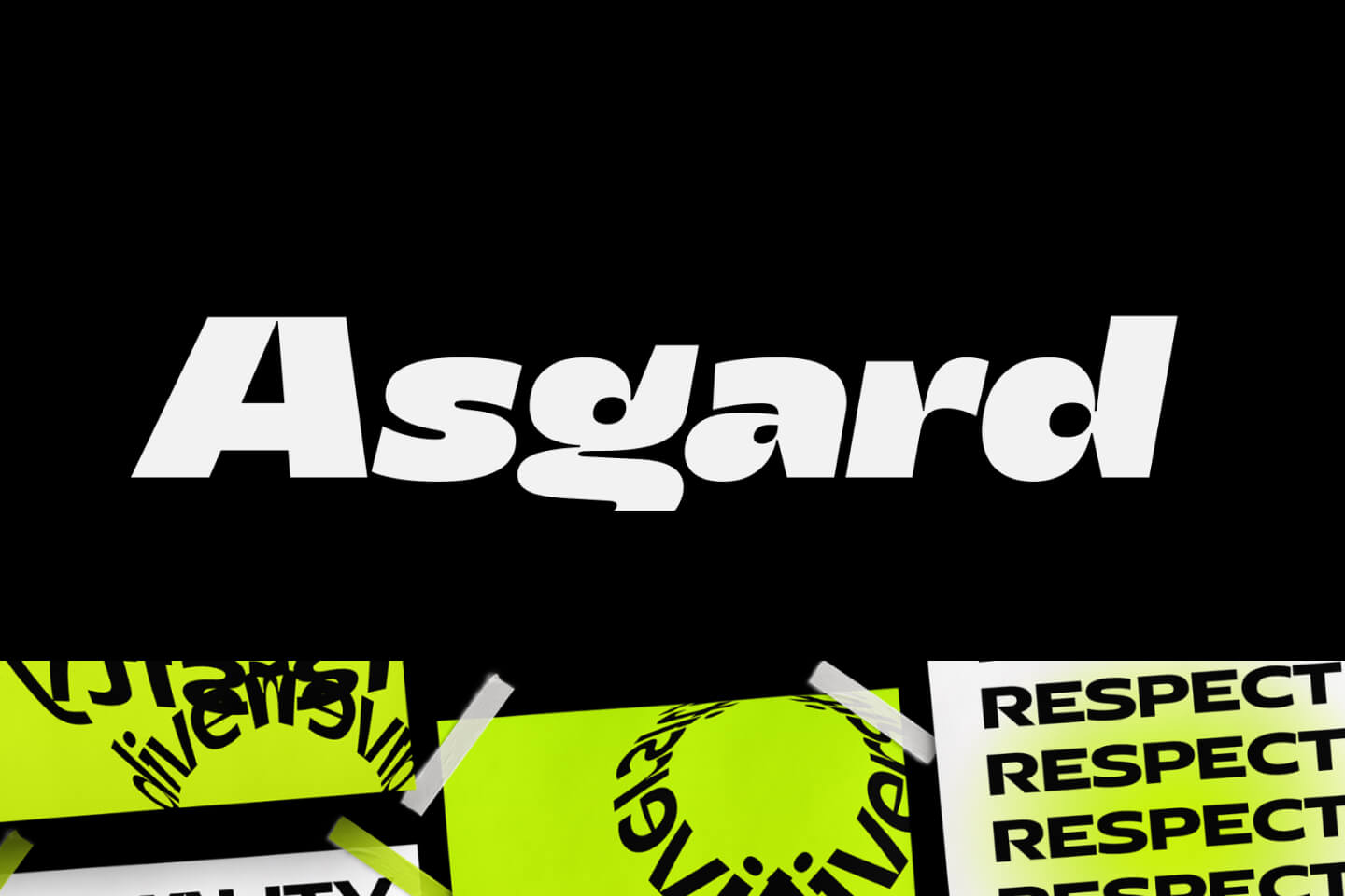
Asgard has gained serious momentum in 2024 for its bold, geometric sans-serif construction that screams logo material. It's frequently mentioned among modern, attention-grabbing logo fonts thanks to its versatile yet impactful presence that works across all contexts. The bold geometric structure is perfectly balanced—distinctive enough to be memorable but clean enough to work professionally.
12. New Kids
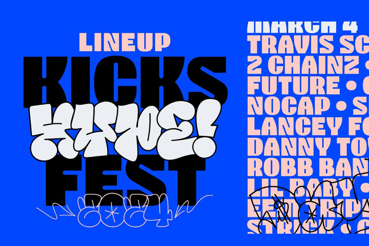
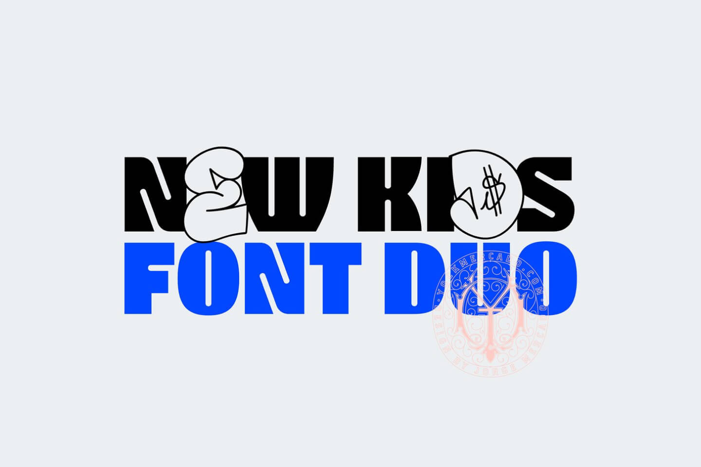
Embracing the street art energy that's trending in 2026, New Kids channels authentic urban creativity with stylized, expressive shapes. It's become a top pick for brands targeting youth, music, or creative cultural scenes who want to project energy and authenticity. The graffiti-inspired forms add serious personality while maintaining enough restraint for professional applications.
13. Monument Grotesk
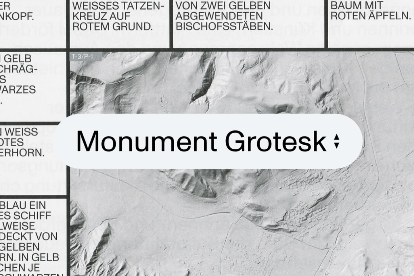
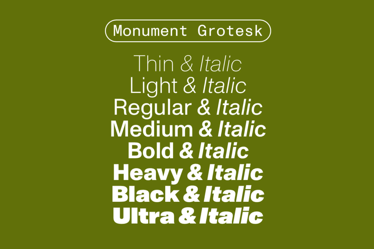
Dinamo's Monument Grotesk brings sturdy, impactful character with slightly unconventional letterforms. It's the choice for brands seeking a bold but polished look that stands out from typical grotesques while maintaining serious design credentials. The distinctive letterforms offer a fresh, contemporary take on classic sans-serif principles.
14. Bulgatti
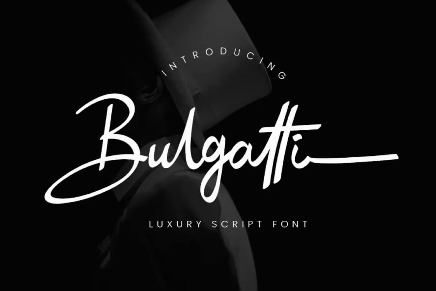
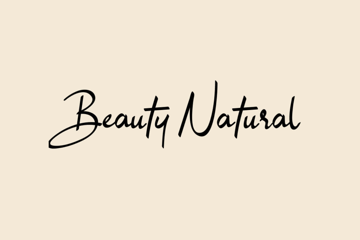
This handwritten script brings elegant, flowing letterforms that feel both personal and professional. Bulgatti has that rare quality of being distinctive without being overly decorative—perfect for brands that want personality with sophistication. The flowing script style adds warmth and human touch while maintaining excellent readability.
15. Caribbean
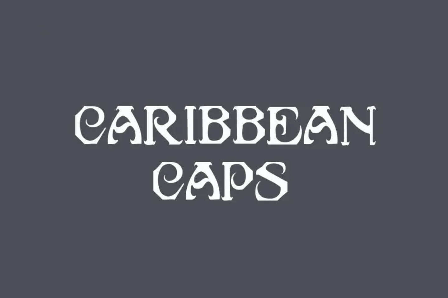
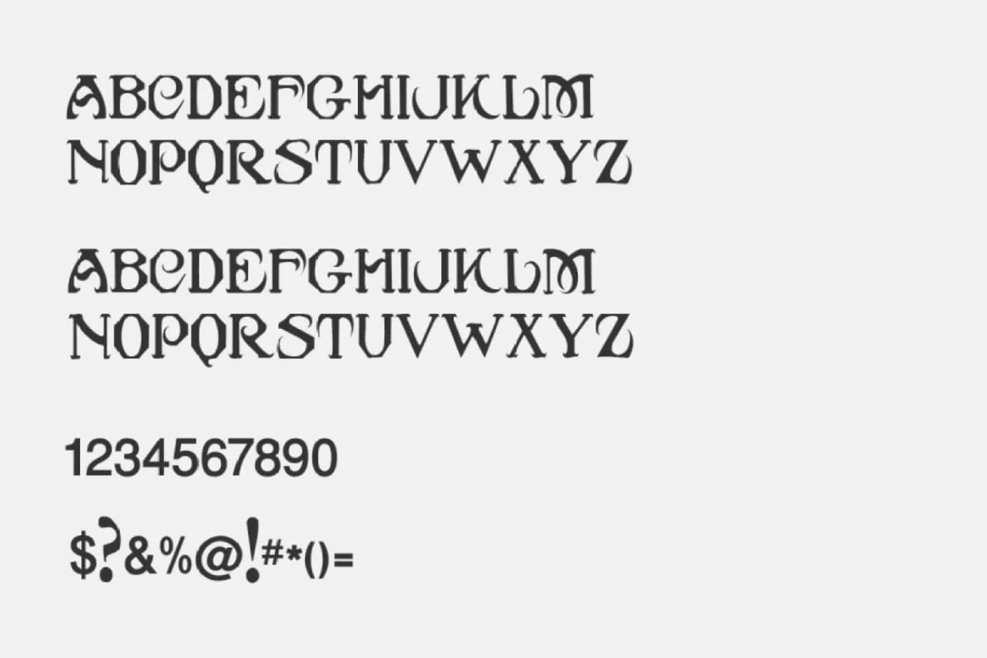
Caribbean brings that relaxed, fluid brush style that's trending in 2026. Unlike generic script fonts, Caribbean fits the handcrafted authenticity movement perfectly—ideal for lifestyle, travel, and fashion branding that wants to convey warmth and personality. The brush strokes feel natural and authentic, adding handcrafted charm without sacrificing legibility.
16. Canela
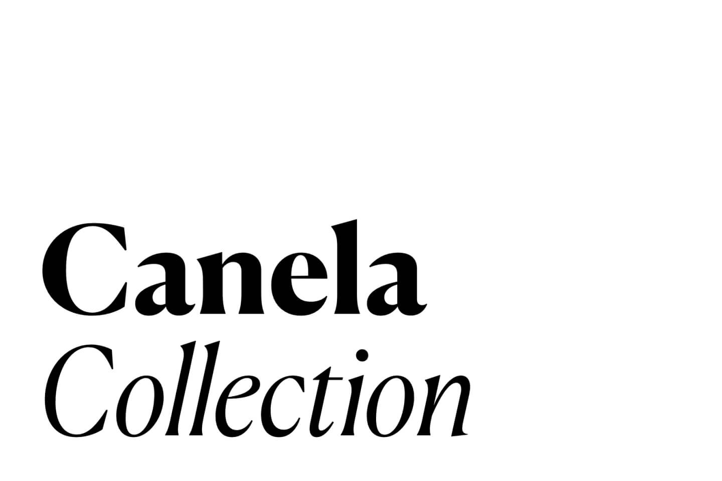
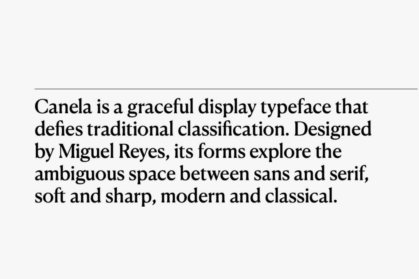
Commercial Type's Canela is a high-contrast serif with striking, distinctive shapes that make logos instantly elegant without feeling dated. It brings that editorial authority that's perfect for brands wanting sophistication with contemporary edge. The dramatic contrast and unique character shapes create immediate visual impact and memorability.
17. Favorit
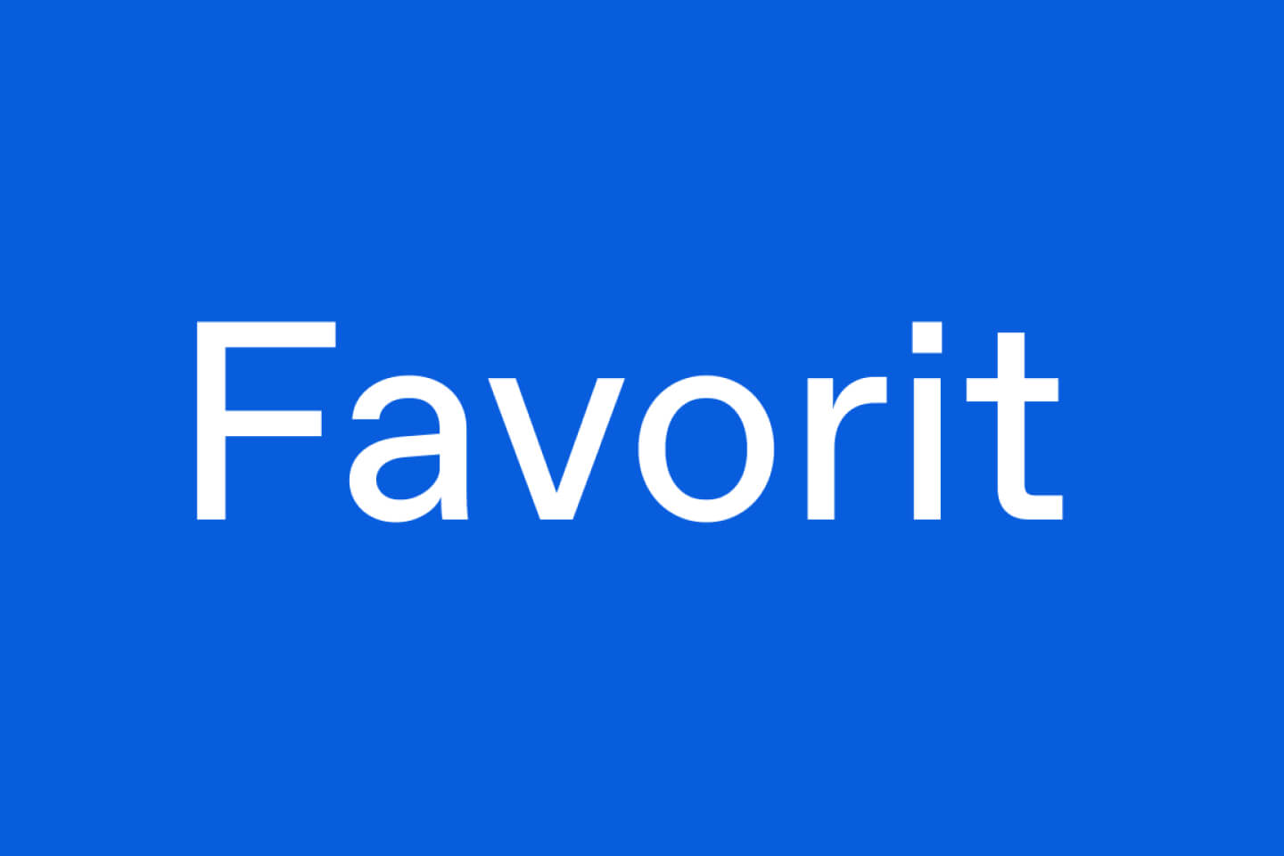
Dinamo's Favorit offers geometric precision with distinctive letterforms that feel fresh and contemporary. It's gaining serious attention among design studios for its unique take on classic sans-serif principles with just enough quirk to be memorable. The geometric structure is balanced with subtle personality touches that make it perfect for modern branding.
18. GT Alpina
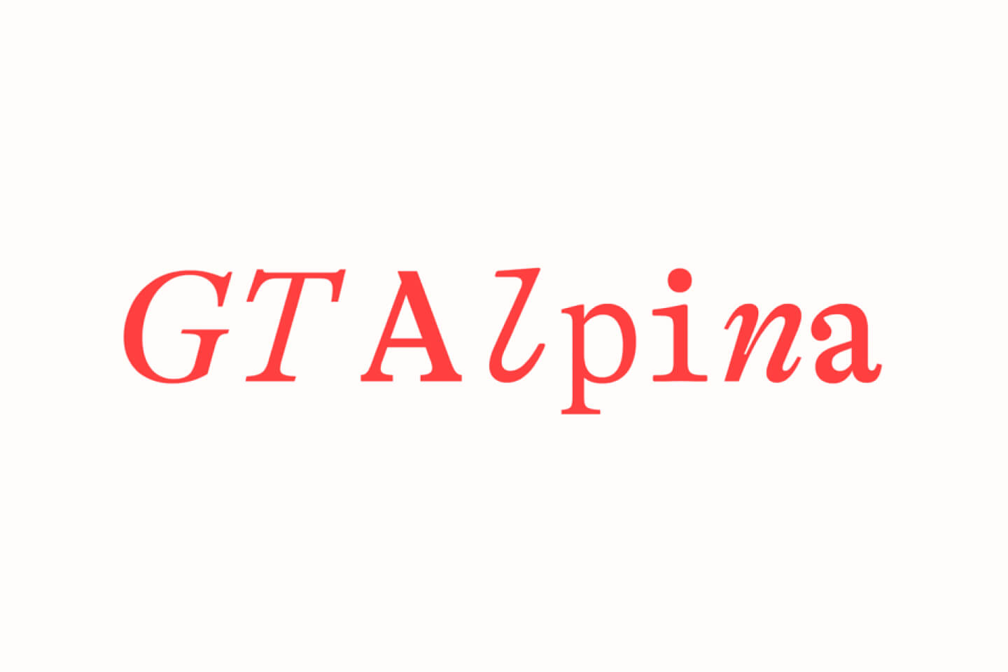
Grilli Type's GT Alpina is a serif with unconventional, expressive details that's ideal for storytelling brands looking for warmth and distinctive personality. It brings editorial credibility with contemporary charm. The unique character details and warm personality make it perfect for brands that want to feel both authoritative and approachable.
19. Söhne
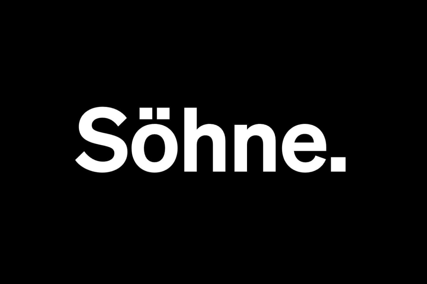
Klim's Söhne takes inspiration from classic grotesques but adds robust, contemporary refinements. It lends brands a serious but approachable image—the kind of font that feels both established and forward-thinking. The refined grotesque structure gives it that perfect balance of authority and accessibility.
How to Choose the Right Logo Font for Your Brand
Now that you've seen the options, how do you pick the right one? I use a simple framework that's never steered me wrong.
Start with your brand personality. Match your font choice to your core identity:
Tech/Innovation: Geist, Clash Grotesk, GT America, Fixel, Open Sauce
Luxury/Premium: Canela, Untitled Sans, GT Alpina, Söhne, Instrument Serif
Friendly/Approachable: Satoshi, Caribbean, Bulgatti, Manrope, Open Sauce
Corporate/Professional: Basis Grotesque, Söhne, GT America, Untitled Sans
Creative/Artistic: Monument Grotesk, Asgard, Graffrow, Deep Fried, Favorit
But personality is just the starting point. You also need to consider technical requirements:
Scalability testing is non-negotiable. Your logo needs to work perfectly whether it's a 16px favicon or a 100-foot billboard. Print your chosen font at 1-inch width and as a thumbnail.
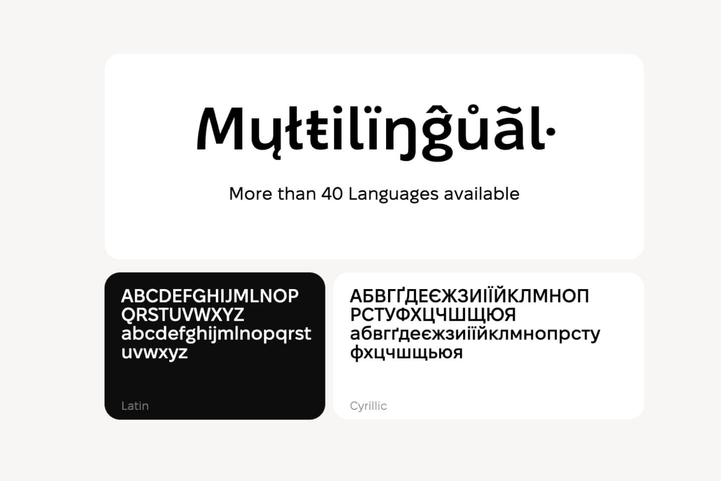
Language support matters more than most designers realize. If you have any international ambitions, choose fonts with extensive character sets.
Variable font benefits are becoming increasingly important. Modern fonts like Geist and Open Sauce offer multiple weights and styles optimized for responsive branding.
Want to see how your chosen font looks in real-world contexts? Mockuuups Studio lets you instantly visualize your logo on business cards, websites, and merchandise. It's the fastest way to test whether your font choice truly has that logo feel.
Current Logo Typography Trends for 2026
If you're wondering what's really shaping logo typography right now, the answer is clear: sans serif fonts are dominating the scene. According to Monotype's Global Font Use Survey, a whopping 76% of designers say readability and accessibility are their top priorities—and sans serifs deliver on both fronts.
Why does this matter for you? Sans serif typefaces aren't just a trend—they're the go-to for brands that need to look sharp everywhere, from digital screens to print and even global campaigns. Their clean lines and adaptability make them the safe (and smart) choice for logos that need to work hard in every context.
Want to see the full picture? Check out the Monotype Global Font Use Survey for all the latest insights straight from the source.
Pro Tips for Logo Font Implementation
Testing your font choice properly can save you months of regret later. Here's my proven process:
Size testing: Print your logo at actual business card size (about 1 inch wide) and as a thumbnail (0.25 inches). If you can't read it clearly at both sizes, it won't work.
Context testing: Mock up your logo on business cards, websites, signage, and merchandise. This is where our Figma plugin becomes invaluable—you can see your logo in dozens of real-world contexts instantly.
Competition audit: Research your market to ensure differentiation. You want to stand out in a way that feels authentic to your brand.
Future-proofing: Consider how your brand might evolve over the next 5-10 years. Choose fonts that can grow with you.
The biggest mistakes I see? Choosing fonts that are too trendy, ignoring licensing restrictions, not testing readability at small sizes, and picking fonts that compete with their message rather than supporting it.
The Perfect Logo Font Becomes Invisible
The best logo fonts have a paradoxical quality: they become invisible. When someone sees your logo, they shouldn't think "nice font"—they should think "trustworthy company" or "innovative brand" or whatever quality you want to project.
That's the real test of a font that feels like a logo. It doesn't call attention to itself; it amplifies your brand's voice.
Whether you choose the tech-forward precision of Geist, the boutique elegance of GT America, or the contemporary character of Clash Grotesk, remember that the best font for your logo is the one that feels so right, it's as if it were designed specifically for your brand.
Your logo font will be seen millions of times throughout your brand's lifetime. Choose one that makes every single impression count.
Ready to bring your logo to life in real-world contexts? Try our free Figma plugin to create stunning mockups that showcase your typography choices professionally.
Further Reading
Looking to master more aspects of design typography?
Best fonts for UI/UX design - Perfect companion to logo typography
How to create mockups in Figma - Showcase your typography in context
What are mockups and how to use them effectively - Master visual presentation
Best business card mockups for professional branding - See your logo typography in print
How to present design mockups to clients - Professional presentation techniques
What's Mockuuups Studio?