9 Figma Tips and Tricks that makes you faster
- Tips & Tricks,
- 5 minutes to read
Whether you’re a newbie or seasoned professional on Figma, you would have discovered there are always more efficient ways of going about your work.
That moment of “Eureka” is so satisfying. Speaking of efficient work, here are some tips you may or may not know that would improve your productivity on Figma, or at the very least make navigation as you work less stressful.
1. Design for mobile-first
Big things have small beginnings, and UI design is no exception. Smaller screen sizes contain less content than bigger screens so instead of designing from big to small and deciding which item on your screen to hide you can design smaller screens with the essentials first and then add the extra elements as the screen size increases. Another advantage of designing mobile-first is because it has reduced functionalities most of the time, this would give you the breathing space you need to really focus on the branding aspect. When you’re done you can expand the display size and work your way up knowing you have a better understanding of what you’re doing.
2. Use the color wheel to generate complementary and contrasting colors when necessary or choose a palette generator to handle that
Colors are the most noticeable feature of product designs at a glance, they speak a special language. In the fast-paced world we live in, patience runs very thin. Your choice of colors would determine whether you can hold the attention of potential users long enough for them to hear what you have to say. A tool that tends to be overlooked is the color wheel. Understanding the basics of the color wheel would greatly improve the aesthetic element of your design, not to mention scrap out the time spent deciding which hues go together. There are numerous automated color palettes right now, these tools can generate palettes with different hues and all you have to do is input one primary color, plugins like this would improve your overall workflow.
3. Use font scale to select base font sizes for consistency across the project
It’s not a bad idea to use a predefined font scale that has set parameters for heading, subheadings, contents, etc. This eliminates the randomized selection process in your typography process. Sticking to this scale in your design process would help you remain consistent without even trying. The ‘font scale’ plugin on Figma is a good tool for this.
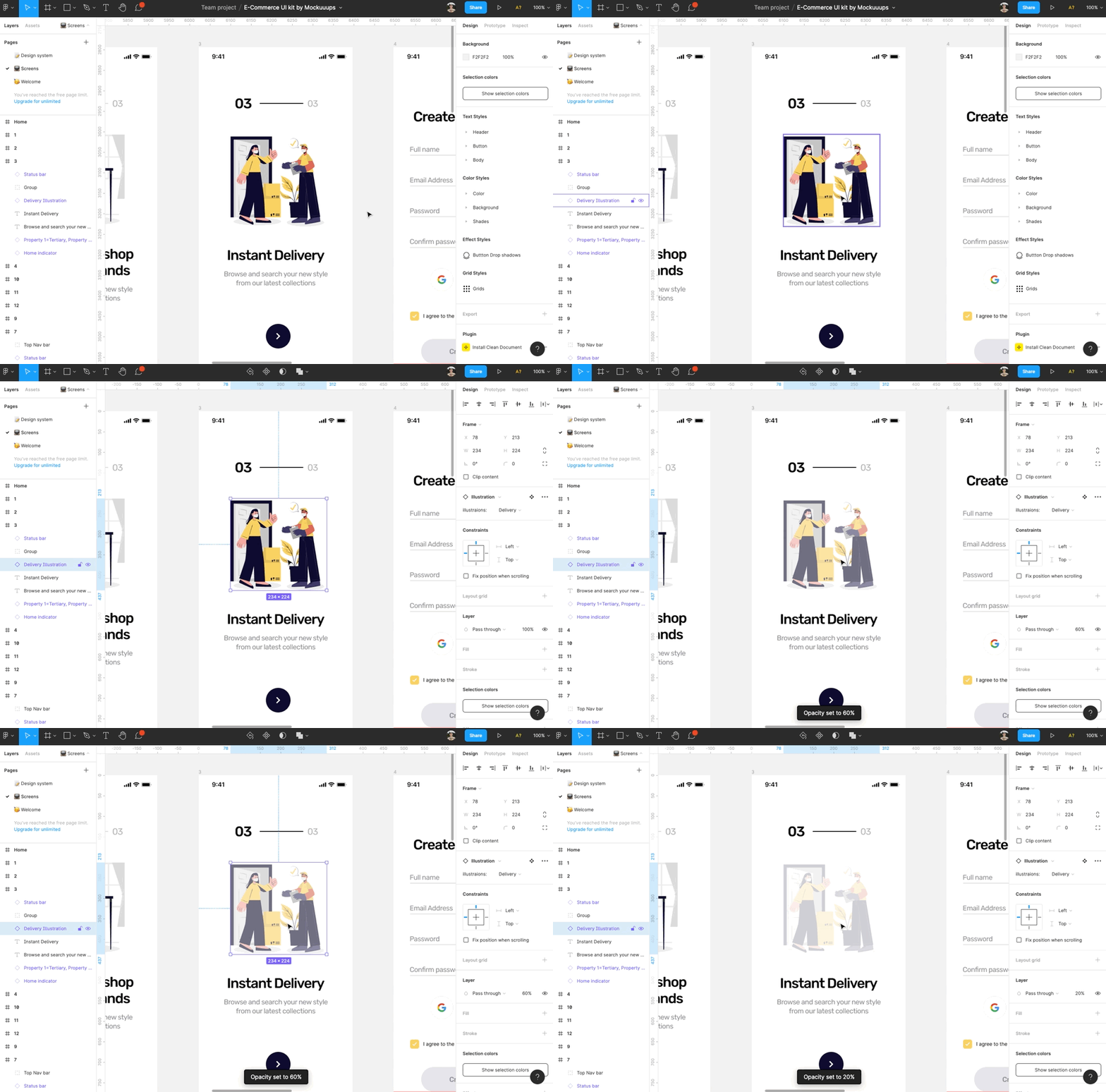
4. Adjust opacity speedily
The endless cycle of mouse movements can be tiring, if you want to change the opacity of shapes or elements quickly, all you have to do is click on it and press the percentage you want. That is 10 for 10%, 25 for 25%, and so on.
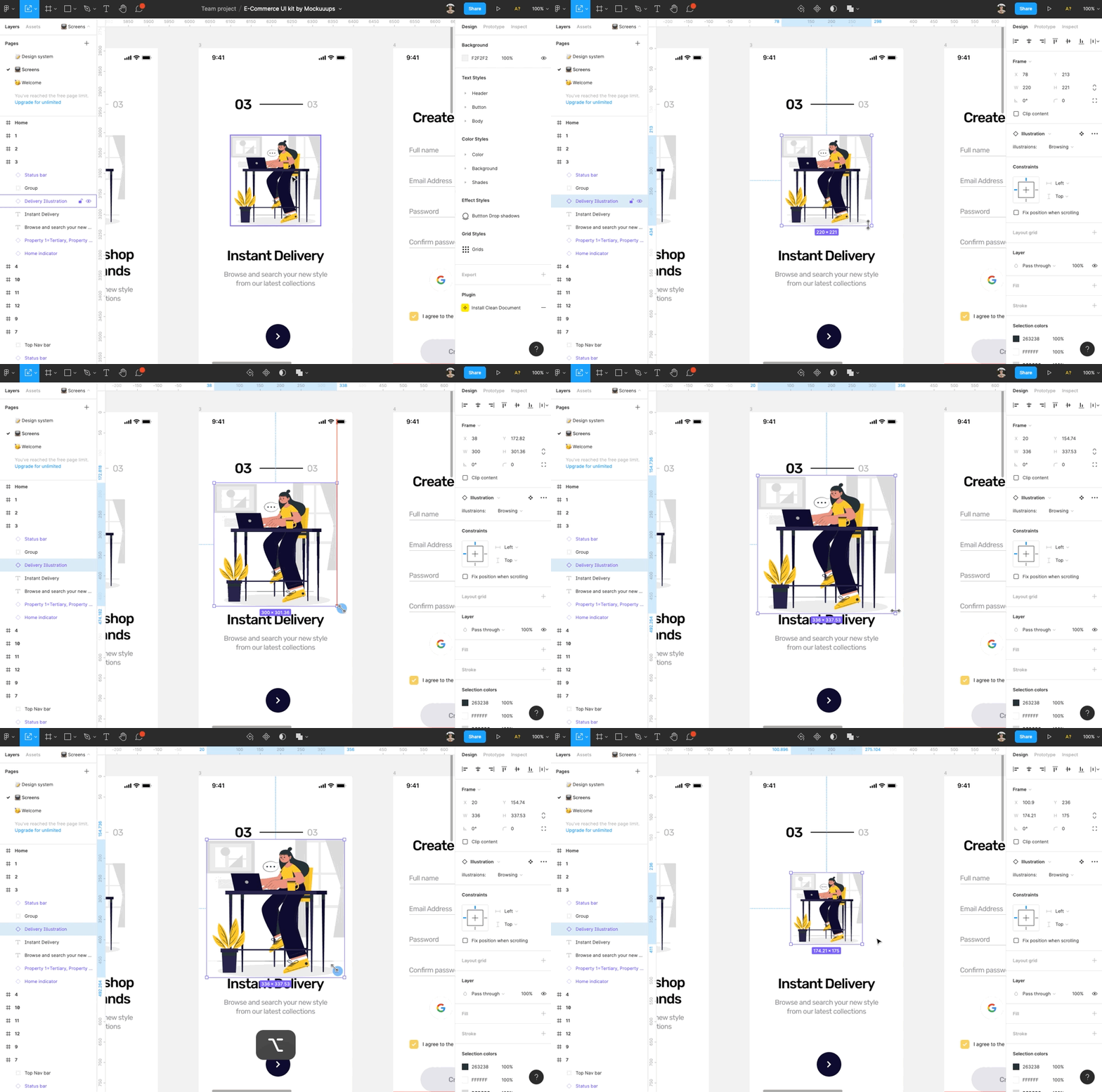
5. Resizing Tips
Hitting K while selecting a frame or element would switch to the scale tool. Its use? It enables you to resize the selected content while it remains proportionate. Holding the alt/option button while resizing would increase it from the center.
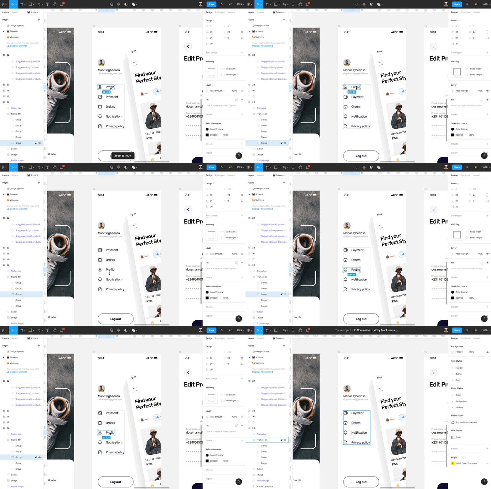
6. Auto-layout is your friend
Designers who incorporate auto layout in their process would eliminate a large number of repetitive works. Buttons rearrange themselves automatically to match text sizes, elements and frames can be keyed to format within a specific constraint every time. Let’s face it, manually adjusting elements and layer’s each time you make a change leaves your work prone to human error unless you’re really thorough in your inspection process. With auto layout the system ensures each object is evenly placed in line with the constraints you set, leaving you with a product that screams professionalism.
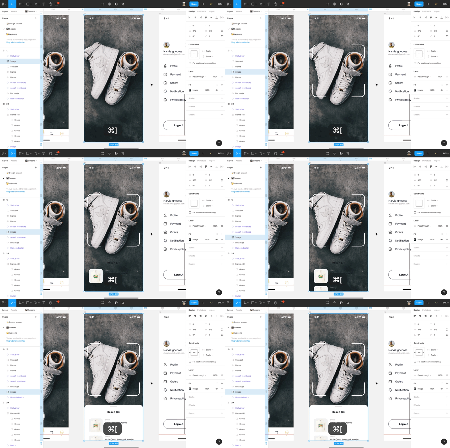
7. Quickly move layers
Using Cmd/Ctrl + [ or ] is another quick way to move layers forward or backward.
8. Collapse all layers
Use Option + L or Alt + L to collapse all Figma layers. Great shortcut for cleaning your Figma file.

9. Tools are there for a reason
Newbie designers tend to go out of their way to make work stressful. Tools are there for a reason, use them. From tools that generate trending color palettes to mockups, Royalty-free images to text generation. Here are some tools that would make your life easier, and they’re all Figma integrated:
Content Reel
Design layouts more efficiently by pulling text strings, images, and icons from one palette. Content Reel lets you create custom content and share it with other Figma users. Collaboration has never been easier!
TinyImage Compressor
Export compressed JPG, PNG, SVG, WebP, GIF, WebM, AVIF and PDF image files directly from Figma
Figma Mockup Plugin
Super-easy mockup generator with over 1000 various scenes. The plugin is packed with everything you need to create product mockups, outstanding marketing materials, even visual content for social media or blog posts.
What you should do now
Try our Figma mockups plugin for free and join over 135K designers like you using it to impress clients and speed up their workflow.
And if you’re already with us, here are more Figma tips to give you the edge:
