Fresh Portfolio Landing Page Inspirations for UI/UX Designers (September 2024)
- Inspiration,
- 9 minutes to read
Discover inspiring portfolio landing pages this September. Explore a curated selection of designs that blend aesthetics and functionality, showcasing effective strategies to capture attention and engage users. Spark your creativity and gain insights for crafting an impactful landing page that highlights your unique skills.
A well-designed landing page can make or break a user's first impression of your brand or portfolio. It's the digital handshake that introduces your work, skills, and personality to potential clients or employers. In this article, we'll explore some inspiring portfolio landing page examples that showcase effective design strategies and provide actionable insights for creating your own standout page.
September's Portfolio Landing Page Inspirations
Get ready to be inspired by these stunning portfolio landing page examples! We've curated a collection of designs that not only look great but also demonstrate best practices in user experience and conversion optimization. From minimalist layouts to bold color choices, these pages offer a wealth of ideas for crafting your own portfolio landing page design.
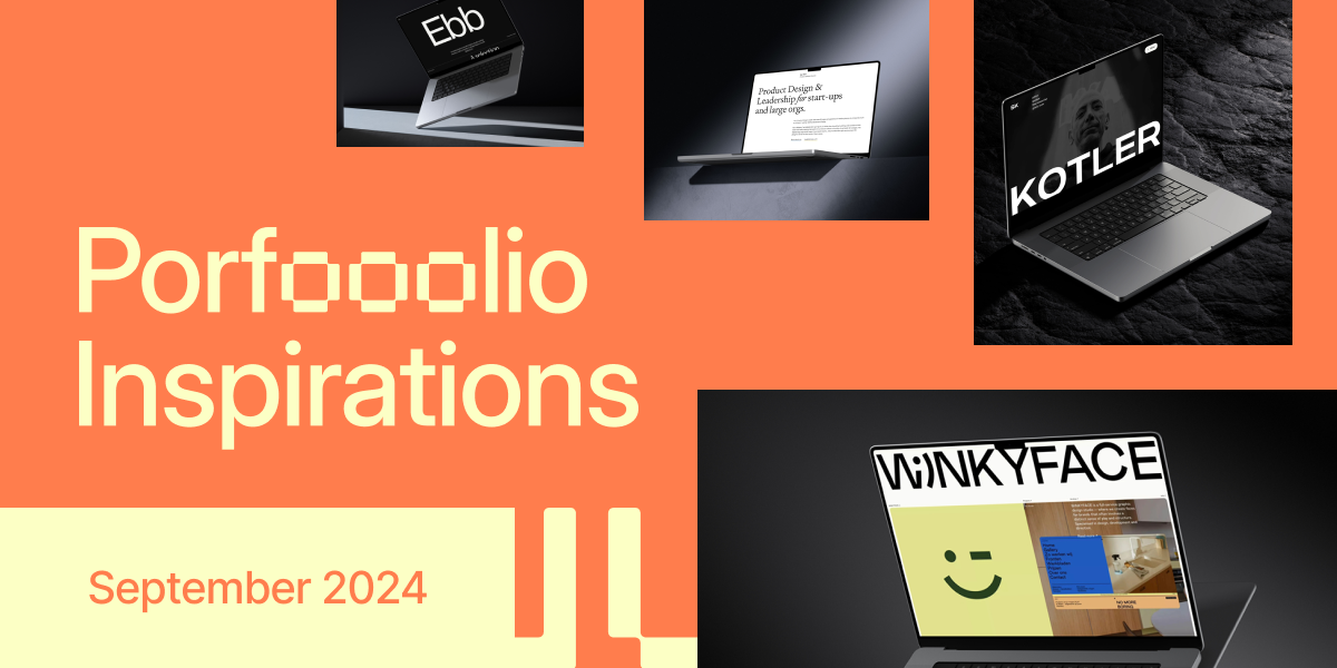
1. WiNKYFACE
WiNKYFACE ;) nails it with their landing page. The color palette is on point, creating a vibe that's both professional and fun. Bold typography grabs your attention and guides you through the content effortlessly. The clean layout makes it a breeze to navigate, while the persuasive copy keeps you hooked. It's clear they know their stuff when it comes to graphic design – the page itself is a testament to their skills. Whether you're a potential client or just browsing, this landing page makes you want to stick around and explore more.
2. Ebb Scandinavia
Ebb Scandinavia's landing page is a masterclass in minimalism. The clean color scheme instantly conveys professionalism, while the thoughtful layout guides visitors effortlessly. Sharp typography and intuitive navigation make browsing a breeze. What really stands out is how they've nailed the messaging - it's short, sweet, and pulls you in. The whole design just clicks, creating a seamless experience that keeps users engaged and wanting more. It's a perfect example of how less can definitely be more in web design.
3. Essen – Boutique branding and design agency New York
Essen's landing page is a masterclass in visual harmony. The color palette is soothing yet impactful, while the typography screams professionalism. What really caught my eye is how the layout naturally guides you through the content. It's like they've laid out a red carpet for your eyes to follow. The navigation? Smooth as butter. And let's talk about that messaging – clear, punchy, and makes you want to dig deeper. It's the kind of first impression that sticks with you.
4. CONSTANT® - Hong Kong Based Global Branding Agency
CONSTANT® nails it with their landing page. The color scheme is on point, creating a vibe that's both professional and inviting. Typography? Crisp and easy on the eyes. What really stands out is how they've laid everything out – it's like they're holding your hand through the site. Navigation is a breeze, and you always know where you're heading. The messaging hits home, making you want to stick around and see what they're all about. It's clear these folks know their stuff when it comes to branding.
5. Trusted - Webflow Agency
MakeBuild's landing page is a masterclass in visual harmony. The orange and white color scheme pops, instantly grabbing attention and conveying energy. Clean typography keeps things readable, while the intuitive layout guides visitors effortlessly. What really stands out is how the design elements work together to create a cohesive, inviting atmosphere. It's clear, persuasive, and makes you want to dig deeper into their offerings. This page doesn't just showcase their design chops – it proves MakeBuild knows how to craft an experience that converts.
6. MBRS - Digital Design Studio
MBRS nails it with their sleek black and white design. The color scheme screams sophistication, while the clean layout guides you effortlessly through the page. I love how they've kept the messaging short and sweet – no fluff, just the good stuff. The featured work adds a nice touch, giving you a taste of what they can do. It's modern, it's engaging, and it gets the job done. If you're after a landing page that balances style and functionality, MBRS is definitely one to check out.
7. studio embed.
Studio Embed's landing page is a masterclass in harmonious design. The color palette is soothing yet eye-catching, while the typography remains crisp and easily readable. I'm impressed by how well-organized the layout is, effortlessly guiding my eyes through the content. The navigation is a breeze, with clear labels that make exploring the site intuitive. What really seals the deal is the compelling messaging that perfectly complements the inviting visual design. It's the kind of page that makes you want to stick around and learn more.
8. Dan Tase - Product Design Director
Dan Tase's landing page is a masterclass in minimalist design. The clean color palette screams professionalism, while the typography keeps things crisp and readable. I love how the layout naturally guides your eye, making navigation a breeze. Clear messaging invites you to dig deeper, and the whole package just feels cohesive. It's a perfect example of how less can definitely be more in web design.
9. SERGIO PENZO
SERGIO PENZO's landing page is a visual treat that blends creativity with professionalism. The harmonious color palette immediately catches the eye, setting a tone that's both inviting and polished. Typography choices are on point, making content easy to digest. What really stands out is the intuitive layout – it's like the page is gently guiding you through the content. Clear messaging seals the deal, effectively communicating what SERGIO PENZO is all about. It's the kind of page that makes you want to stick around and explore more.
10. Built for Archives
Built for Archives nails the minimalist vibe with a clean, pro color palette. The bold, easy-to-read text fits perfectly with the layout, naturally drawing your eye where it needs to go. Navigation's a breeze, and the messaging hits the mark, making you want to dig deeper. It's a masterclass in first impressions, proving that sometimes, less really is more in the world of digital design.
11. Vagabond films
Vagabond films nails it with their production services landing page. The clean design uses a soothing color palette that's easy on the eyes. Typography is spot-on, making content a breeze to read. What really stands out is how they've structured the layout – it's like they're holding your hand through their services. Visuals are top-notch and work seamlessly with the copy. Navigation? Smooth as butter. It's clear they've put thought into user experience, making sure visitors stick around and explore. Overall, it's a masterclass in creating a professional, engaging first impression that speaks volumes about their brand.
12. Steven Kotler
Steven Kotler's landing page is a masterclass in sophisticated design. The dark color scheme creates an atmosphere of focus and intensity, perfectly aligning with his work on peak performance. Typography is on point, making content easily digestible. The layout guides you smoothly through each section, from his books to speaking engagements. Clear messaging and intuitive navigation make exploring the site a breeze. It's a perfect example of how a personal brand can shine through thoughtful web design.
13. Opening Hours Studio
Opening Hours Studio nails the minimalist vibe with their landing page. The muted colors scream sophistication, while the clean typography keeps things crystal clear. I love how the airy layout naturally guides my eyes, but I gotta say, the navigation feels a bit shy. It's there, but it's playing hide and seek. The overall effect? It's intriguing, but it could use a bit more oomph to really pull me in. Still, if you're into sleek and subtle, this page is definitely worth a look.
Key Takeaways
After exploring these portfolio landing page examples, several key takeaways emerge:
Minimalism works: Many of these landing pages demonstrate that a clean, minimalist design can be highly effective in showcasing work and conveying professionalism.
Color matters: Thoughtful color schemes can set the tone for your brand and create a memorable first impression.
Typography is crucial: Clear, readable typography enhances the user experience and helps convey your message effectively.
Intuitive navigation: Easy-to-use navigation is essential for keeping visitors engaged and helping them find what they're looking for.
Compelling messaging: Short, punchy copy that clearly communicates your value proposition can make a big difference in conversion rates.
Visual hierarchy: A well-structured layout guides visitors through your content and highlights key information.
Showcase your work: Featuring examples of your best projects can immediately demonstrate your skills and capabilities.
Consistency: Maintaining a cohesive design throughout your landing page reinforces your brand identity and creates a polished look.
These portfolio landing page designs offer valuable inspiration for creating your own standout page. Remember, the key is to balance aesthetics with functionality, ensuring your page not only looks great but also effectively communicates your skills and engages potential clients or employers.
Further Reading
Ready to take your design skills to the next level? We’ve got you covered with some extra brain food that’ll keep your creative juices flowing.
First up, check out our collection of UI/UX Design Quotes. It’s like a pep talk from design legends, all wrapped up in one article. Whether you need a motivation boost or just want to impress your colleagues at the next meetup, these nuggets of wisdom have got your back. From timeless principles to cutting-edge insights, it’s a goldmine for designers at any stage of their career.
But wait, there’s more! If you’re a tools junkie (and let’s face it, who isn’t?), you’ll want to dive into our roundup of Top Design Tools for September 2024. We’ve done the heavy lifting to find the coolest, most game-changing tools out there. From AI-powered prototyping to collaboration tools that’ll make your team feel like mind-readers, this list is packed with goodies that’ll supercharge your workflow.
So go ahead, give these a read. Your future self (and your impressed clients) will thank you. Happy designing!
What's Mockuuups Studio?


")