How to improve UI/UX skills?
- Tips & Tricks,
- 10 minutes to read
Are you struggling to learn UI/UX design? Understanding design principles is the key to success. Here we explore 7 ways to improve your design skills, plus the best books and resources for success.
If you’re here, chances are you’re trying to find:
- What you can actually do to get better at UI/UX design daily.
- How to cut through the noise and find the resources worth consuming.
- What UI/UX fundamentals you need to focus on.
- How to actually practice designing rather than memorizing tactics and principles.
- The books and courses worth your precious time.
Before we dive into how to improve your UI/UX skills, it’s important to remember design isn’t voodoo magic.
There are rules that govern good design — known as principles.
Rather than blindly following Youtube resources, you want to take action and focus on principles to build on like:
- Understanding design hierarchy
- How white space works
- Color usage
- And typography
Because once you’ve set a focus for learning, you’re less likely to fall into the content loop, spinning your wheels, and feel like you’re making progress.
Here we’ll explore 7 ways you can improve your design skills, followed by the communities favorite books and resources.
Here are 7 ways you can improve your UI/UX skills
1. Absorb and practice UI design patterns
The more you study good design, the more you’ll see the underlying principles shining through. A great exercise is to find websites you like, take a screenshot, and sit them in your design tool. Then add guidelines to elements to reverse engineer how things like spacing, color, and typography work. Over time by analyzing the work of inspirational designers, you’ll absorb how principles are used in practice to apply to your own work.
Depending on your interests, here’s where to find good design:
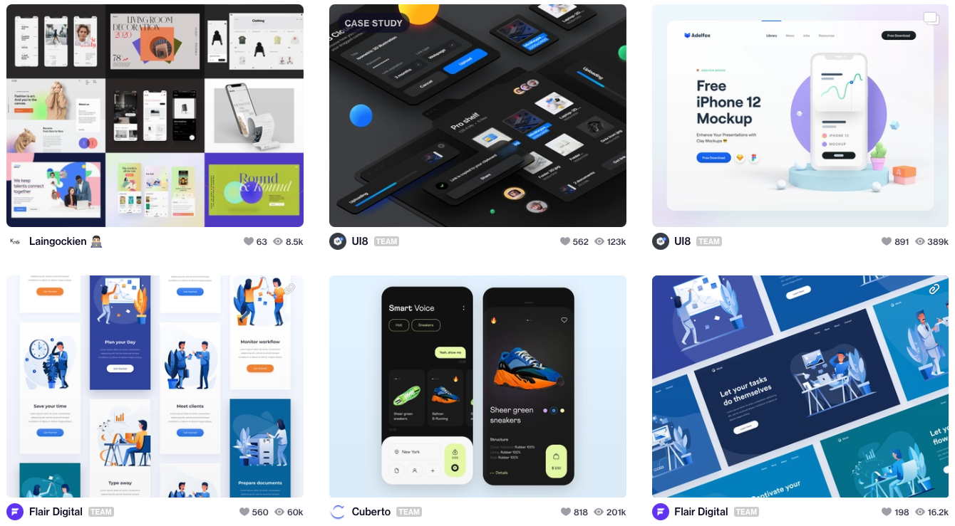
Dribbble – the place where all the world’s top designers share their work and portfolios.
Good UI – the place to find designs tested against each other for user conversion.
Mobbin – a curated collection of over 50,000+ mobile app screenshots.
Really good UX – see designs across the whole user journey (Great for those who deal with user experience.)
UI patterns – the home of recurring design patterns designers use to solve common UI problems.
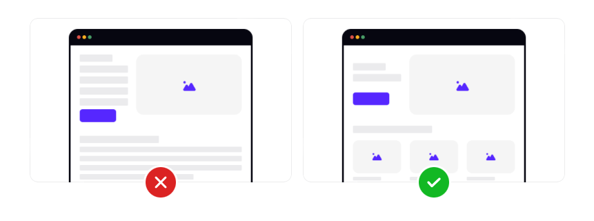
2. Learn and practice hierarchy
In UI design, hierarchy is a key principle to master. People are impatient. Making it easy to find information is key to having them stick around.
When you’re designing your next project, try and take yourself out of your own head and ask questions like:
- What are users coming for on this page?
- How can I make the most important information easiest to view?
- How can I make it easy for them to make choices?
Color, sizing spacing, and positioning are all tools of hierarchy. But to implement them, there are design rules to master like:
- When reducing the size of your typography your spacing should go up too.
- Getting to grips with hierarchy scaling systems like 1-4 – this helps you focus the information you want to bring forth.
I won’t go into these principles now, but the book Don’t Make Me Think is a must-read for everything hierarchy.
3. Get familiar with grids for UI layouts
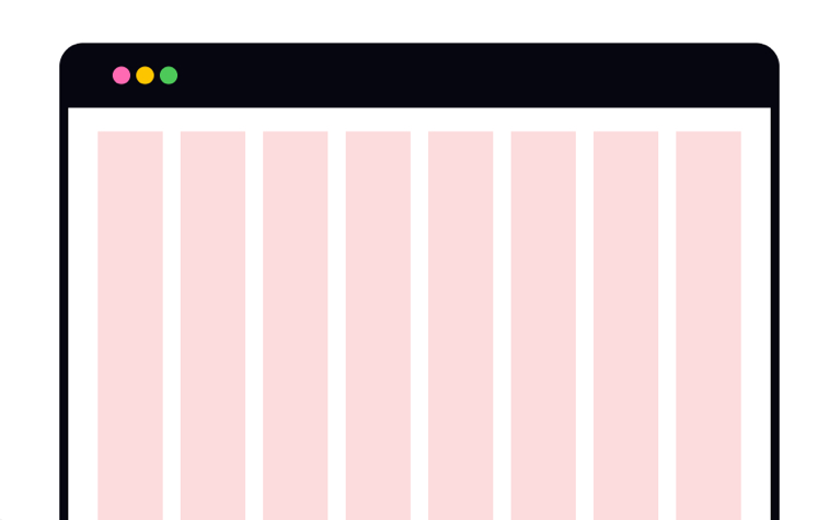
Grids are lines and columns used to provide the structural foundations for UI design to keep consistent rhythm and spacing.
The 12-column grid is common in web design because it’s divisible by a ton of numbers for symmetry. Getting familiar with common grids and more advanced ones like responsive grids will help cement your knowledge of spacing and hierarchy.
Once you get good at working within different girds, you’ll start to notice when you can break the rules.
Girds are also what developers work from when building interfaces.
4. Practice from the ground up and have a design “philosophy”
I saw this tip on a Dribbble post, where Olia Gozha talks about building on a solid foundation.
When you learn a new design tactic, it’s easy to get excited and add to designs. But with every design, you should start with a solid foundation. Start by structuring your layout, getting the correct spacing, and grouping in low-fidelity first. Once your foundation is in place it’s then you can build upon it. For each design, before starting you might want to give yourself a design philosophy, telling yourself something like:
“This website design is going to focus on minimalism and simplicity”
This way, when it comes to adding elements to your foundation, you can challenge yourself at every step and ask, “why am I doing this?”
5. Take action, practice, and share your work with others
While you can read, watch videos, and consume content – It’s not the most efficient way to improve. Instead, the best way to put yourself out there is to be vulnerable, try things, and ask for feedback. I’m a big believer in just-in-time learning over just-in-case learning to cement knowledge into your brain instantly.
But how can you practice?
Practice real briefs and tweak existing designs
Rather than waiting for permission to start, you can find design briefs to hone specific skills. Platforms like Brief Box list brief categories like, “killer homepages” and “widgets, dashboards & UI” to help you put the reps in.
Alternatively, you could find websites, UIs, and apps and add elements to the design on what you think is worth improving.
By doing this, not only do you build up your portfolio, you can share your designs and increase your chances of landing a gig!
Share designs with those ahead of you
If you don’t have a network, that’s fine. You can join communities like Reddit or spark up conversations on LinkedIn. And if you’re an in-person type, start attending regular meetups.
Once you’ve built a few connections, share designs with those ahead of you – they’ll give you ideas and insights you have not thought of. If you’re in a hurry you might like places like Brief Box – here you'll be connected with professional mentors.
Take on freelance gigs
With freelancing, you only have to be one step better than the person hiring you. There’s someone out there that needs your skills.
You can start on sites like Upwork, telling friends what you’re up to, or contacting local agencies. NGOs always need help and working on these types of projects can get you great portfolio pieces.
Share your work in public
On the internet sharing your work is permission-less. You can pick up a pre-made brief from sites like Brief Box or start adding twists to existing websites and share openly for feedback.
Although this might seem scary, sharing your designs in public in places like Dribble and Twitter people will start to notice. I’m a big believer in increasing your “luck surface area.”
I came across this concept on Codus Operandi’s blog. It means you can increase your chances of “getting lucky” by doing two things:
- Taking action towards your goals.
- Communicating what you’ve done effectively to multiple people.
When you multiply the two together you increase your luck surface area, put simply: Luck = (Passionate) Doing x (Effective) Telling.
The key takeaway…
Ultimately, the best way to get better at UI design is to focus on absorbing core principles and taking action. By taking action, I don’t mean more content consumption, but _actually _designing and getting feedback.
As my favorite You-tuber, Matt quotes from the book how to win friends and influence people…
“The great aim of education is not knowledge, but action.” -Herbert Spencer
The best UI/UX content, books, and courses
Must-read design books
When reading these UX books, don't passively read. Read a few times, take notes, and take action on what you learn.
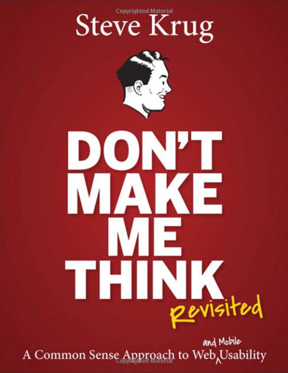
Don't Make Me Think, Revisited
This is the perfect entry book to digital design and the most recommended book around the net. If you’re feeling overwhelmed and not knowing where to start – pick this up.
On the reading list of most courses and boot camps. Although it might not seem UI related, it’s there to teach you design principles through things you see and use daily.
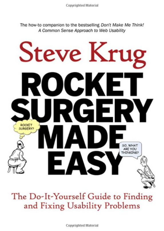
Rocket Surgery Made Easy: The Do-It-Yourself Guide to Finding and Fixing Usability Problem
Written by Krugg, the same guy as Don’t Make Me Think. This book gives you a no-fluff actionable way to do your own usability testing, a key part of the design process.
Top design courses
Google’s UX Design Certificate Having browsed the Reddit design community forums, Google’s UX design certificate is a popular choice. Designed to give you a solid foundation to build on. At ~$39 USD per month, it seems a great low-risk, tried, and tested option for those looking to start — compared to the $5 - $10K boot camps out there — plus, you’ll gain portfolio projects for when you apply to gigs.
Udemy’s top-rated – Freelance web design course Another popular option among the design community is this Udemy course aimed at freelance designers. I might be biased but the hands-on aspect of this — the money-back guarantee — and the Figma focus make it a compelling choice for you entrepreneurs out there.
Learn UI – UX and UI Courses We love Learn UI’s weekly newsletter, so much so, that I’ve linked it below — and they have two courses, one on UX design and one on UI design.
The UI Design course is video based with 35+ hours of lessons. It’s designed to be an over-the-shoulder view of a professional designer.
You get the lessons, a slack channel for feedback on your designs, and a palace where the teacher, Erik reworks the designs submitted by students. While we haven’t tried them ourselves, this seems like a great formula for action-based learning.
Refactoring UI Course Another trusty Reddit recommendation, refactoring UI has a unique value proposition – meant for those with a developer background who what they’re ideas to look awesome, without relying on a designer. It teaches you everything from starting your design, hierarchy, layout, spacing, text, and working with color. (Just about everything outlined in this article.)
Design newsletters and resources
Design Hacks – Learn UI/UX design This newsletter helps you become a better designer, in short, 5-minute lessons each week. Loved by over 50,000+ designers at Figma Academy, CCS Tricks, and more – it’s one not to miss.
NN-Group Blog NN Group is arguably the best resource for learning UX UI topics – with over 1500+ solid articles diving into research findings, guidelines, and UX methods – it’s taking a look around. Don Norman the founder wrote The Design of Everyday Things.
Mockuuups Studio Newsletter Mockuuups Studio gives designers like you thousands of drag-and-drop mockups to make your designs shine. But that’s not all we do… Like this post, we’re on a mission to help our fellow designers level up their careers — come join 135,000+ designers like you reading Mockuuups Studio newsletter. ---
What you should do now
If you’re looking for UX/UI gigs, you’ll love our guide on putting together your portfolio case studies:
Discover:
- The recruiter “turn-off” that most designers get wrong in their case studies (easy fix).
- How to present portfolio screenshots and interactive designs – without PSD templates.
- The 5 things you can do today to land more gigs (from Tobias at Semplice and The Futur.)
This short, easy-to-read post is packed full of examples you won’t want to miss! Check it out here: How to make your UX portfolio land more gigs
