Why You Should Start Thinking about Inclusive Design
- Tips & Tricks,
- 8 minutes to read
Inclusive design transcends a fixed outline of rules, It is our approach towards consumer satisfaction as a whole.
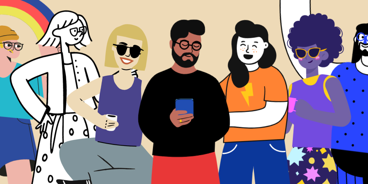
Illustration by Blush
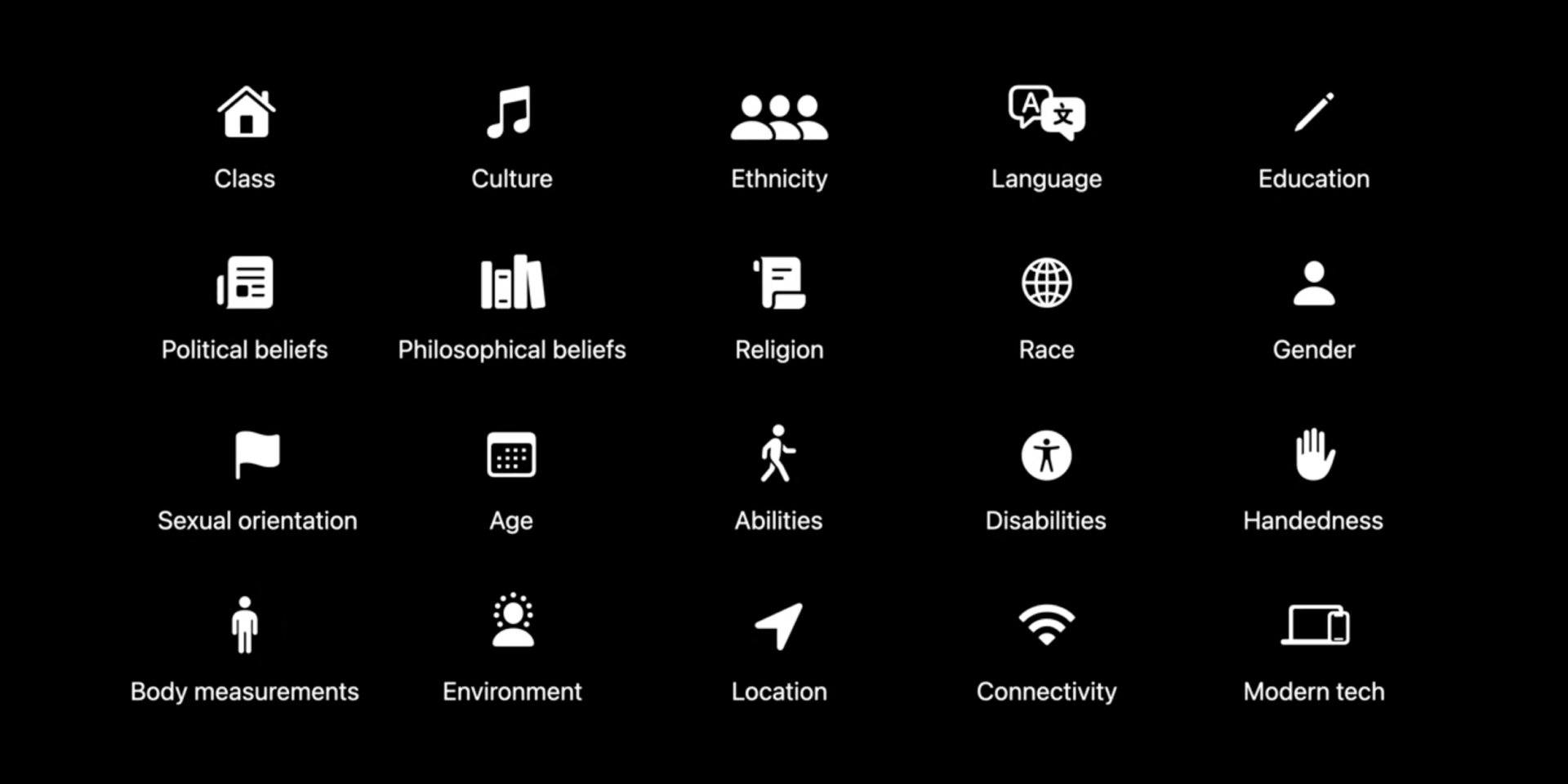
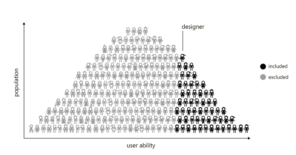
Inclusive design takes into consideration the difference in physical abilities, age, gender, different cultures, and perspectives, language, sexual orientation. The list goes on and on. In short, inclusive design is ensuring our products are set up in a way that leaves everyone a sense of belonging, which means considering every factor that can lead to exclusion.
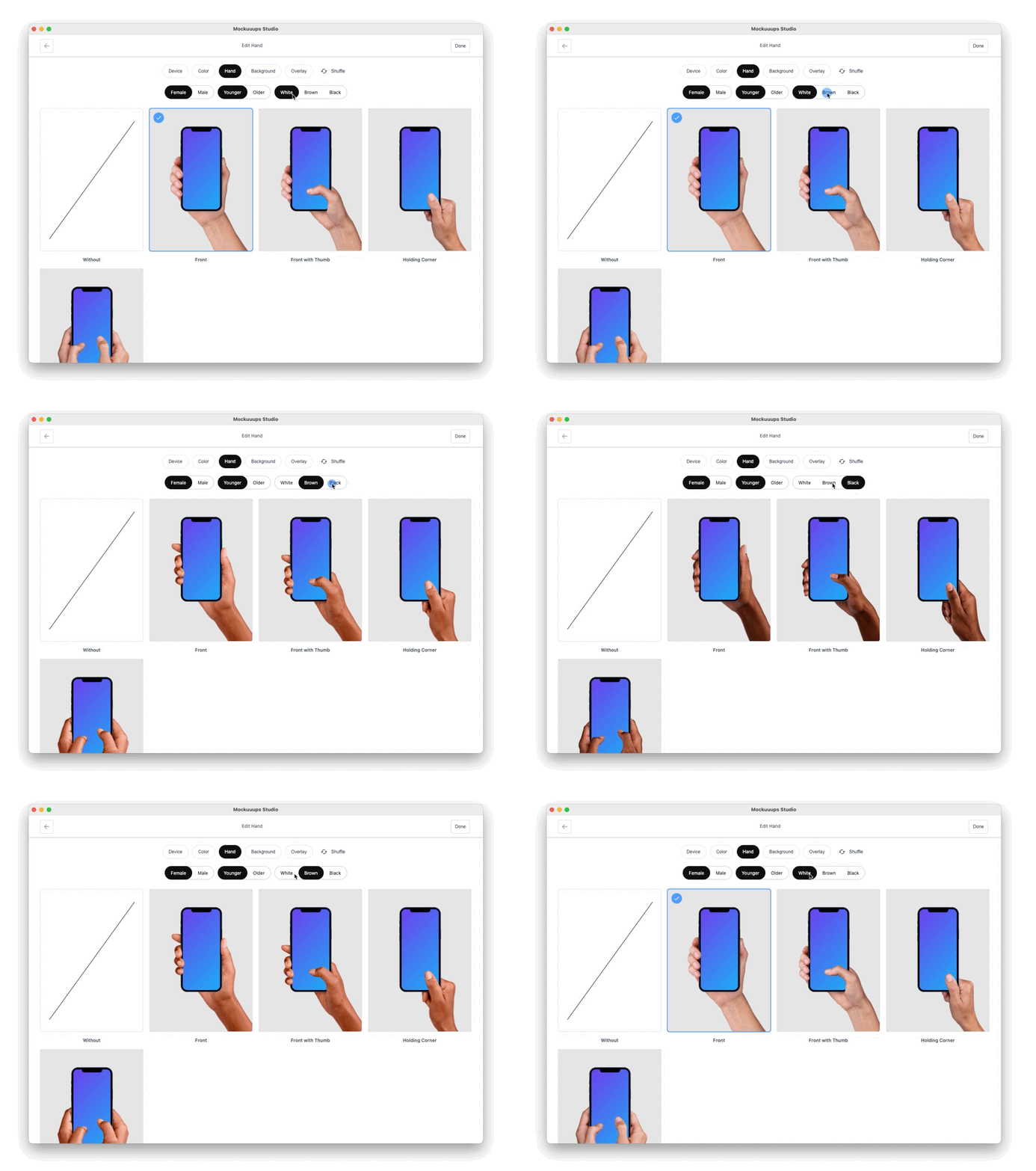
Before we talk about how inclusive design improves a product let’s look at how a product without it feels like. Have you ever found yourself googling how to access a section of a site or app? As a dark-colored person does it bother you that model hands used on products are more often than not light-skinned. Why is there no diversity?
Have you ever come across job-specific platforms meant for newbies with a web layout that leaves you stumped at every point. You're faced with top-tier diction and vocabulary meant for experts in the field. it makes the site look professional and intellectual, but does it leave you with a feeling that you're part of something and not just an outsider. Would individuals with no experience in that specific field be able to sift through all that jargon for understanding? More often than not you would close the site out of exasperation and look for something that makes you feel inclusive.
Apple recently addressed all this in the video it released about the practice of inclusive design. For a design to be truly inclusive it needs to tick a range of points. It's not just about using easy-to-understand words, it's not just about usability, it involves your choice in colors, accessibility, the gender undertones of your work, and much more.
Why is inclusive design important?
When you think about the vast amount of people, cultures, religions, that occupy the earth, it becomes obvious that an app/website/product, designed with data extracted from a specific country or region might pose usability problems to people from a different one. And that’s the beginning, you have to consider differences in genders, physical abilities, sexuality, skin color, to name a few. It is the wish of every content creator that their products cross the barriers of distance, time, and ideological differences. The only way this is possible is if users feel like they’re part of it, you achieve this by utilizing inclusive design in your work.
Inclusive design principles
Before your journey on having an inclusive mindset begins, you should;
Understand the people you design for
It’s not just enough to pick up your laptop or tablet and start working, you need to understand who your target market is at the core, and get in touch with them. If you’re designing a product that helps college students get their schoolwork better scheduled, the best place to get ideas is by visiting nearby colleges and handing out questionnaires, compiling data, leaving you with a product ultimately made by its users. Proper research done on your target consumers leaves you better equipped to solve problems.
Take genders into consideration
You need to include the difference in genders in your design process; Be conscious of the pronouns you use. There was a time when ‘man’ was often used in generalizing both genders but times and trends are changing. As designers, it is our job to flow with the trend. Pronouns, like he, his, posted at every corner would have a first-time female user thinking the company must be run by a world-class misogynist. With people identifying as something new every day it is best to avoid gender-specific pronouns completely, excluding contents meant for a specific gender of course. Another way to make your design gender-inclusive is your choice of avatars, in some situations a simple male and female avatar won’t suffice. You can solve this problem by using gender-neutral avatars. Also, avoid presuming the relationship status of your target consumers.
The need to consider the difference in sexual orientation
As we design our product the difference in sexual orientations of users should be part of the process. If you want your product to get a farther reach you would need to consider the difference and tailor your content accordingly. A good way to do this is; When selecting stock photos of couples you can switch between using same-sex and opposite-sex photos. This would make people with different sexual orientations feel included in your design process.
Diverse Hands
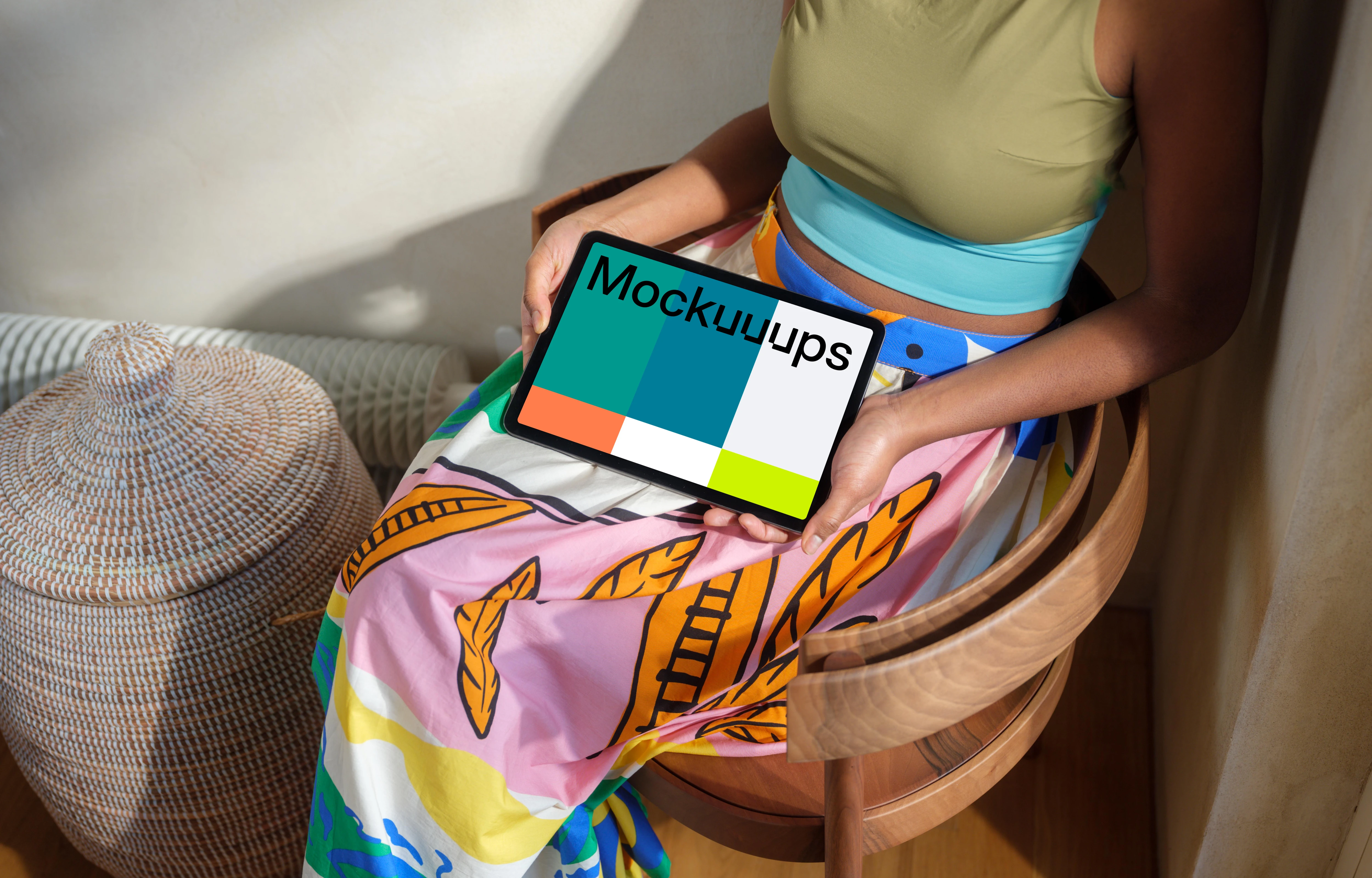
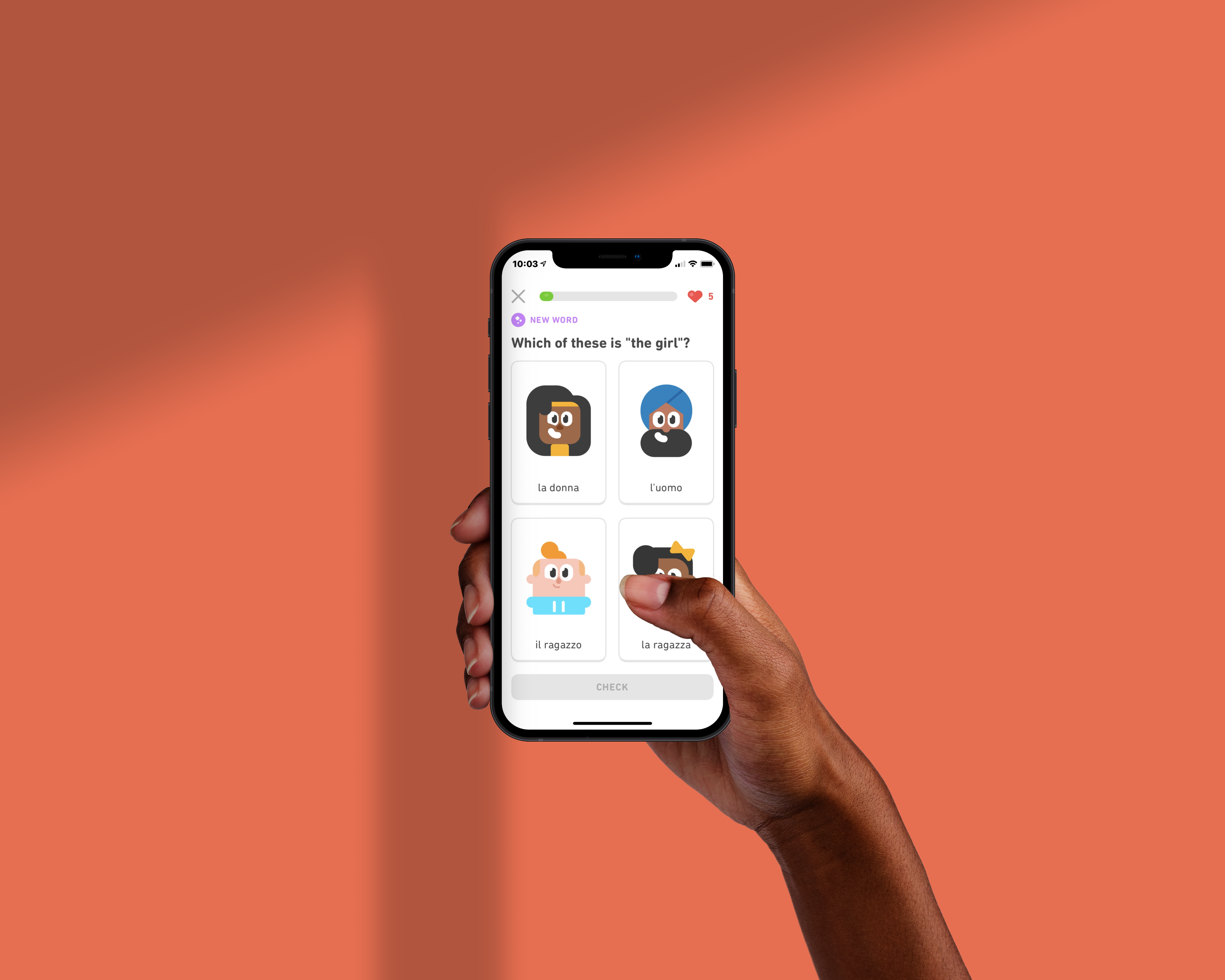
As much as we love to say we are one, humans are physically different. When designing for different regions, you need to take into consideration things like skin tone, language, culture, religion. The purpose of doing this is to make a product created specifically for them, something they feel a part of. A good way to design with diversity in mind is with Mockuuups diverse device hands option. You can choose the age, ethnicity of the hands used in your mockups.
Identify exclusion points
The best way to get results is to identify potential problems. When you approach a design seeking problems you would find solutions as a consequence. Look for cracks in your design where users might feel stumped. It helps to switch to different devices in varying scenarios. Making it a point to identify these problems in your design stage would improve the overall quality of your work, enabling you to deliver a product that doesn’t touch a need lightly, but addresses it and eliminates it completely.
Practice what you preach
Different people approach problems differently, having a team of designers from different age groups, ethnicity and backgrounds would leave you with a team able to see things from different perspectives. In your design process, there are certain challenges encountered that just need someone willing to approach things differently, by utilizing diversity in the creation phase it is going to be felt by consumers who use it.
Get the user involved
The only way a design can be truly inclusive is when the user is not just a fleeting part of the design process but a continuous never-ending component that keeps the whole body moving. How do we do this? By making sure there is a permanent link between the designer and the user, it becomes crucial when embarking into areas with little existing data. Who is in the best position to tell you about how they like things done but the users?
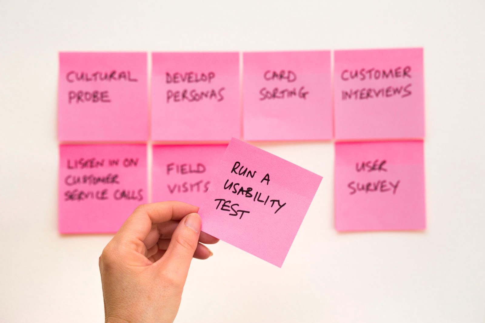
You can get the user involved by finding out their needs, you can set up meets with your target demographic. A good customer service system is instrumental in making your users part of the day-to-day operations. By requesting feedback, reviews, and encouraging complaints, you ensure there is a constant link between the user and the designer. All this shows that you’re dedicated to overall consumer satisfaction and are willing to act swiftly on problems brought up. Why not take it a step further by scheduling phone calls with your users, it shows more empathy than a text.it touches them personally as they feel it’s more than an unfeeling venture but one that goes the extra mile.
Design with accessibility in mind
When designing any product this is the most important thing point to check. If a product isn’t accessible it presents a challenge it starts with your choice of words on the product; complicated words not used often leave users behind.
You should also consider people with disabilities: for instance, when uploading on your site adding a subtitle would go a long way in showing your inclusion of people with different physical limitations. Your choice of colors; would it be visible in bright lights? Would it be too bright at night? These are things you should consider. as we use our mobile phones in varying situations, on trains, at the sunny beach, at night with all the lights turned off, a user interface that is easy to comprehend at a glance makes the product accessible.
As we practice inclusion in our day-to-day designs you need a tool to make your work easier. Mockuuups Studio provides more than 900 mockups with. What better way to let your users know your app or website is specifically made to meet their needs than with a device-specific mockup. With Mockuuups you have the option of choosing how you want your device held with a variety of poses available. You can also edit the ethnicity and age of the models with our diverse device hands option. There is an amazing variety of background combinations available including; gradients, transparent, colors. Mockuuups Studio is easy to use with the seamless integration option on Figma and sketch.
