Fresh Portfolio Landing Page Inspirations for UI/UX Designers (July 2024)
- Inspiration,
- 9 minutes to read
Explore fresh landing page designs this July, curated to spark your creativity. Each example blends form and function, demonstrating how to make a lasting impression while converting visitors. Dive in for insights that's invaluable for any UI/UX designer looking to enhance their portfolio presentation.
A well-designed portfolio landing page is crucial for UI/UX designers looking to make a strong first impression and showcase their skills effectively. It's often the first point of contact between designers and potential clients or employers, making it a powerful tool for personal branding and career advancement. This article aims to provide inspiration and actionable insights for creating effective portfolio landing pages, highlighting some of the best examples in the industry.
July's Top Portfolio Landing Page Inspirations
As we dive into this month's selection of portfolio landing page examples, prepare to be inspired by a diverse range of designs that showcase creativity, functionality, and effective personal branding. These carefully curated examples demonstrate how UI/UX designers can create compelling portfolio landing pages that not only look great but also effectively communicate their skills and expertise.
1. Pact Studio Inc
Pact's landing page is a masterclass in balance and simplicity. The soothing pastel palette creates a welcoming atmosphere, while bold typography demands attention. I love how the layout guides my eye effortlessly through the content. It's clear they've put thought into user experience, with intuitive navigation and persuasive messaging that makes me want to dive deeper. The design elements work together seamlessly, reflecting the partnership aspect of their brand. It's a great example of how a well-crafted landing page can effectively communicate a company's ethos and services.
2. Studio Juicebox
Studio Juicebox's landing page is a feast for the eyes. The vibrant color scheme pops, instantly drawing you in and setting the tone for creativity. Bold, readable typography ensures the message comes across loud and clear. The modern layout guides your eye smoothly through the content, making navigation a breeze. It's like the digital equivalent of a warm welcome mat – inviting and encouraging you to explore further. This page doesn't just showcase their work; it's a testament to their design philosophy.
3. Supermarket
Supermarket's landing page is a feast for the eyes. With a color palette that pops and typography that's easy on the eyes, it's love at first sight. The layout is a masterclass in organization, smoothly guiding visitors from services to client work and team info. No need for a map here – the navigation is crystal clear, and the messaging gets straight to the point. It's like they've rolled out the digital red carpet, making you want to explore every nook and cranny of their site. If first impressions count, Supermarket is definitely scoring high marks.
4. Watson — Los Angeles & London
Watson's landing page is a masterclass in minimalism. The monochrome color scheme creates a sleek, professional vibe that's easy on the eyes. Bold typography grabs your attention, while the clean layout naturally guides you through the content. It's simple yet sophisticated, striking a balance between style and functionality. While the conversational tone is refreshing, there's room for more persuasive content to really seal the deal. Overall, it's a solid example of how less can definitely be more in web design.
5. JEFF.XYZ
JEFF.XYZ's landing page is a masterclass in bold design. It grabs attention with a punchy color scheme and strong typography, striking the perfect balance between professionalism and creativity. The layout is a dream to navigate, guiding visitors effortlessly through the content. What really shines is the messaging - it's short, sweet, and packs a punch. From the moment you land, you're drawn in and eager to explore more. It's a perfect example of how a well-designed landing page can make a lasting first impression.
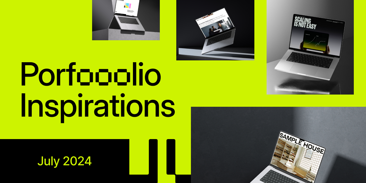
6. SAMPLE HOUSE
SAMPLE HOUSE nails it with their landing page. It's a masterclass in elegant design, blending colors that just work and typography that's easy on the eyes. The layout? It's like they read my mind, guiding me exactly where I want to go. Navigation's a breeze, and everything's labeled crystal clear. But what really got me was the messaging – it's inviting and straight to the point. No fluff, just the good stuff. It's the kind of page that makes you want to stick around and explore more. If you're looking for inspiration on how to make a killer first impression, this is it.
7. Better Off Studio
Better Off Studio nails it with their landing page. The color scheme screams pro and creative vibes. Bold, readable typography makes the content pop. I love how the layout guides my eye smoothly through the messaging - it's concise and persuasive. The whole page feels inviting and well-organized, making me want to dig deeper. It's a perfect example of how a landing page should work: clear, engaging, and effective.
8. GENBRAND
GENBRAND's landing page is a masterclass in visual harmony. The color palette is spot-on, creating a cohesive look that's easy on the eyes. Bold typography grabs attention and makes reading a breeze. The layout? Smooth as silk, guiding visitors naturally through the content. Navigation's a cinch with clear, no-nonsense menu labels. They've nailed the messaging too – short, sweet, and persuasive. It's the kind of page that makes you want to stick around and see what's next. First impressions matter, and GENBRAND's landing page delivers in spades.
9. Doze Studio
Doze Studio's landing page is a masterclass in modern design. The sleek layout and harmonious color palette instantly grab your attention, setting a professional tone. Clean typography and intuitive navigation make browsing a breeze. What really stands out is how the persuasive messaging flows seamlessly with the design, creating a compelling narrative that draws you in. It's not just a pretty face - this page is crafted to guide visitors effortlessly through the content, making a strong first impression that lingers.
10. Milk Network
Milk Network's homepage is a masterclass in modern design. The clean layout and harmonious color scheme create a visually appealing first impression. Typography is consistent and readable, guiding visitors effortlessly through the content. The intuitive navigation and well-organized structure make exploring the site a breeze. Clear, persuasive messaging encourages deeper engagement, while the overall aesthetic perfectly balances professionalism with creativity. This landing page effectively showcases Milk Network's brand development expertise through its own thoughtful design.
11. Other Land
Other Land's landing page is a masterclass in balanced design. The color palette screams professionalism while hinting at innovation. Typography? Spot-on readability and consistency. The layout guides your eyes like a pro, serving up persuasive content without overwhelming. Navigation's a breeze, and the first impression? It's like a warm invitation to explore further. This page shows how a well-crafted design can effortlessly communicate a brand's essence and capabilities.
12. NO/ONES/WATCHING
NO/ONES/WATCHING nails it with a landing page that's both eye-catching and user-friendly. The color palette is spot-on, mixing bold and subtle hues for a modern vibe. Typography? Clean and consistent, making everything a breeze to read. The layout guides you smoothly through the content, and navigation couldn't be simpler. What really stands out is the messaging – clear, persuasive, and drawing you in from the get-go. It's the kind of page that makes you want to stick around and explore. Overall, it's a masterclass in professional design that packs a visual punch.
13. NORD ID
NORD ID's landing page is a masterclass in UI design. The color palette exudes confidence and trust, while the typography keeps things crisp and readable. I love how the layout guides my eye naturally, making exploration a breeze. Content is on point – no fluff, just the good stuff that makes me want to dive deeper. It's like they've rolled out the digital red carpet, inviting me in without being pushy. If you're looking for inspiration on how to make a stellar first impression, this page is definitely worth a peek.
Key Takeaways
After exploring these inspiring portfolio landing page examples, several key takeaways emerge for creating effective UX portfolio landing pages:
Visual Impact: A strong color palette and cohesive design elements create a memorable first impression.
Clear Navigation: Intuitive navigation helps visitors easily explore your work and information.
Compelling Messaging: Concise, persuasive content that clearly communicates your skills and unique value proposition is crucial.
Balanced Layout: A well-structured layout guides visitors through your content effortlessly.
Consistency: Maintain consistent typography, color schemes, and design elements throughout the page.
Showcase Personality: Let your unique style shine through to differentiate yourself from other designers.
Mobile Responsiveness: Ensure your portfolio landing page looks great on all devices.
Fast Loading Speed: Optimize images and code for quick loading times to keep visitors engaged.
Call-to-Action: Include clear CTAs to encourage further interaction or contact.
Storytelling: Use your portfolio landing page to tell your professional story and highlight your journey as a designer.
These portfolio landing page examples demonstrate the power of effective design in showcasing skills and creating a strong personal brand. By incorporating these elements into your own portfolio landing page design, you can create a compelling showcase of your work that resonates with potential clients and employers.
Further Reading
Well, there you have it - a buffet of killer portfolio landing page examples to feast your eyes on. But hey, why stop here when your design journey's just getting spicy?
For those of you itching to level up even more (and let's face it, who isn't?), I've got a couple of ace articles up my sleeve that'll knock your socks off.
First up, we've got How to Improve UI/UX Skills. Think of this as your personal design gym. It's packed with practical tips and insider tricks to beef up your UI/UX muscles. Whether you're a newbie or a seasoned pro, there's something in here to push your skills to the next level.
Next on the menu is Best Bento Grid Design Examples. If you're looking to add some extra zing to your portfolio, this one's for you. Bento grids are the hot new thing in design, and this article serves up some mouthwatering examples. It's like a masterclass in modern, eye-catching layouts.
Both these reads are perfect for taking what you've learned here and cranking it up to eleven. They're packed with actionable advice and fresh ideas that'll have you crafting portfolios that not only look good but work like a charm too.
Remember, in this fast-paced design world, staying ahead of the curve isn't just nice - it's necessary. So go on, dive into these articles, and watch your design game soar. Your future clients (and your portfolio) will thank you!
What's Mockuuups Studio?