How to make an attention-grabbing UX portfolio to land your next client
- Tips & Tricks,
- 6 minutes to read
The dreaded portfolio. Every creative needs one, but finishing it and being happy with it are two different things. So much so, it’s a standing joke among the designer community…
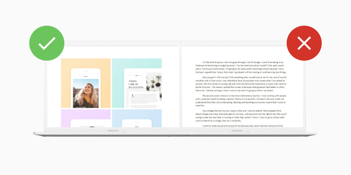
But what separates a mediocre UX designer's portfolio from one that grabs attention? First, let’s dig into what a portfolio is, then dive into how you can make yours stand out in the sea of sameness…
What is a UX designer portfolio? (Brief Summary)
A UX portfolio is your chance to showcase how you work, what you’ve done, and sell your unique self. You’d use one to win a client or land an interview, so its main job is to grab attention.
Typically a UX portfolio includes 3-4 relevant case studies to the role you’re applying to or gig you’re trying to land. Showing not just what you did, but how you did it. This way, when someone looks at it, they can understand your expertise and design process.
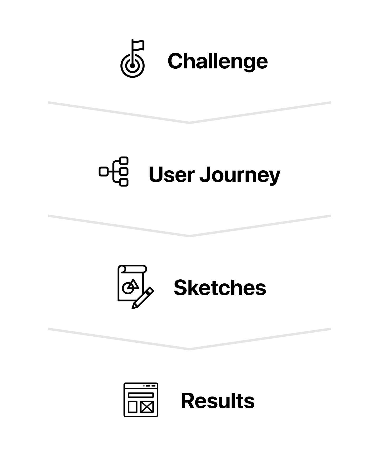
If this sounds daunting, don’t worry. To extract these details they often follow a simple template like this one:
The idea here is, you’ll get to dig into each project end-to-end, giving a feel of how you overcome challenges to get the final product or result.
And in a moment, we’ll share some tools with you to help make a case study focussed portfolio. But first, let’s mention a common pitfall to watch out for…
What’s wrong with UX portfolio “Formulas”
Case study formulas like the one above are OK for the reasons mentioned. They let you extract all the relevant details potential employers look for. And let clients see what you're like to work with.
But as influential designer Tobias van Schneider mentioned recently… “designers are programmed to follow these “case study formulas” from boot camps and are scared to break the norm.” Thus at risk of looking bland and another designer without showcasing your strengths!
Your portfolio offers a chance to sell yourself, your process, and your style to land interviews and win clients.
How to take your UX portfolio to the next level
According to The Futur Academy and Schneider; Here are 5 things desingers to keep in mind when putting together your portfolio, plus some handy tools for standing out…
1. Give a feeling of who you are.
Your portfolio is your personality on paper. Besides sticking to the traditional formula, try sprinkling in some uniqueness to you and get creative! This could be how you solve problems, your unique style, or even your past experiences.
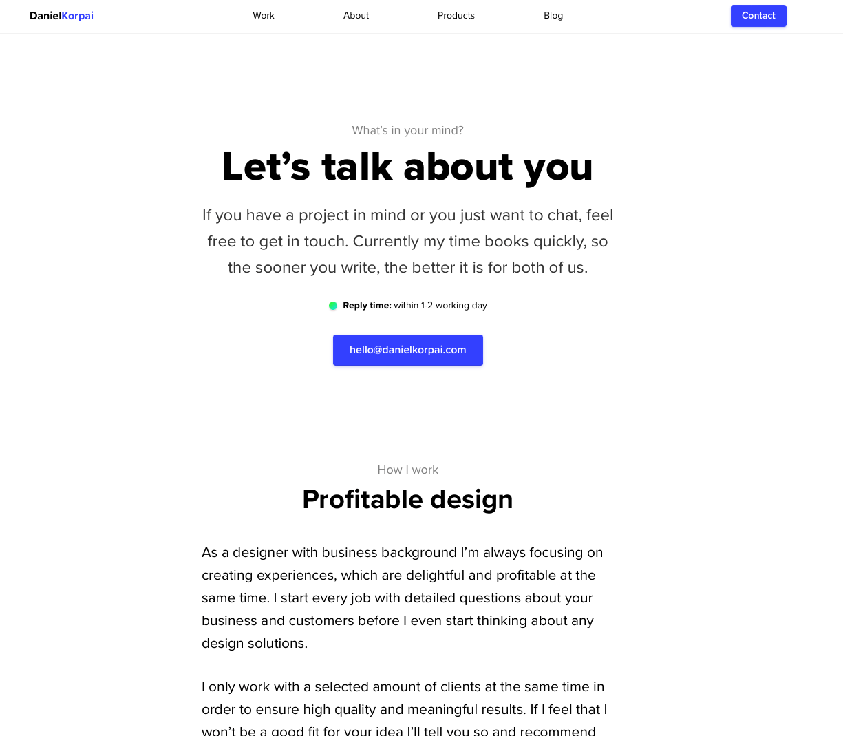
UX Portfolio by Daniel Korpai
With everyone sharing the same bland “process.” Use this opportunity to break through and share your strengths and interests! Recruiters want something interesting and different – that’s what they’re looking for.
And clients? They want to FEEL what it’s like to work with you.
2. Show off your deep expertise.
Rather than trying to make a generic portfolio for everything. Try and be clear about what you do best and tailor it to the roles or clients you want to land. This is especially important for freelancers. People buy specialties not generalities, so communicating “I serve people like you” is key.
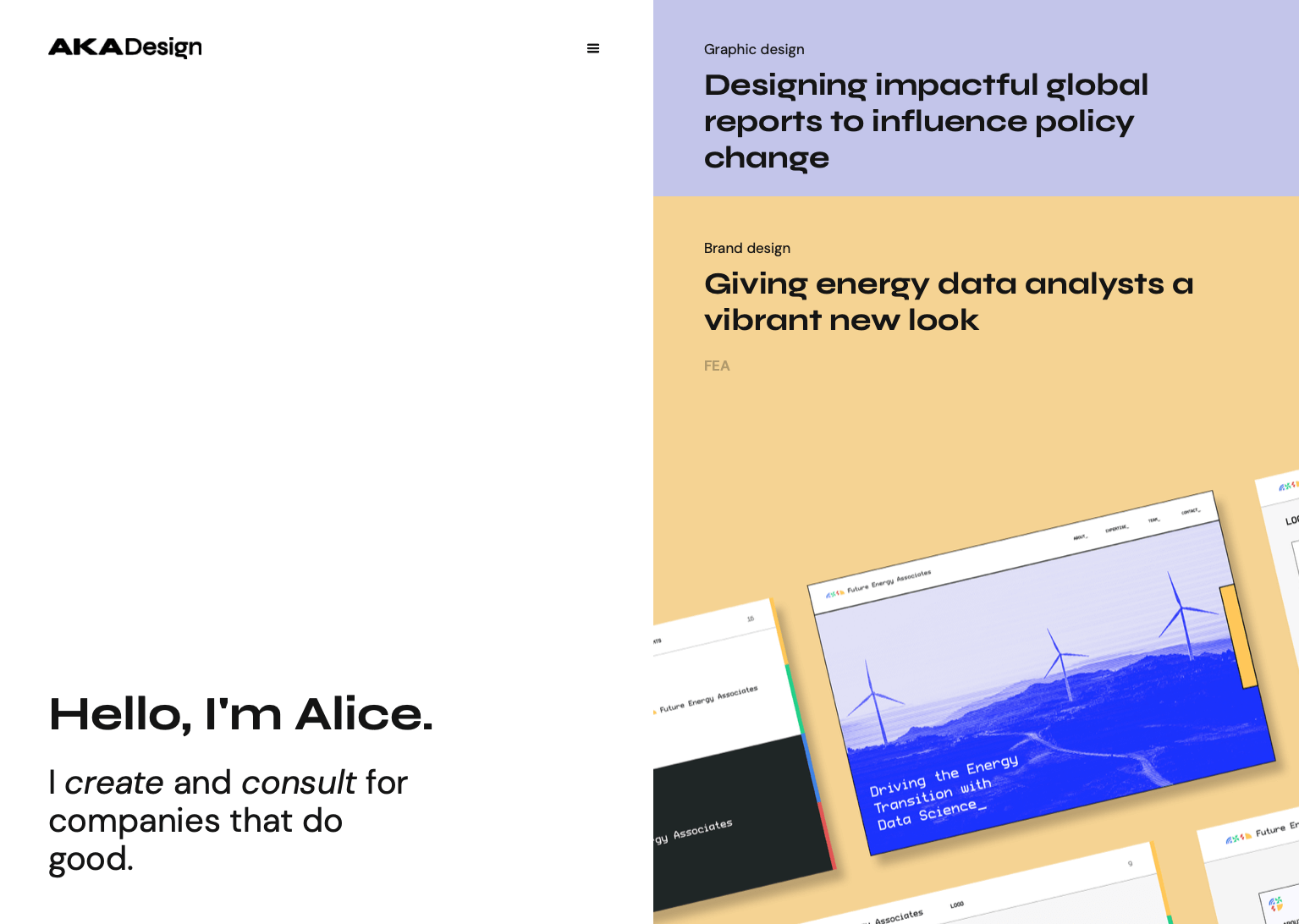
Don’t be afraid of leaving things out. Having a few tailored pieces of work tailed to the role is far better than looking like you’re not sure what you do.
3. Think like a journalist.
Case study templates are great for helping you extract all the relevant details. But once you have the details. It’s time to refine it. Try limiting yourself to a number of characters. Or pretend you're writing a tweet or magazine caption to avoid any technical jargon.
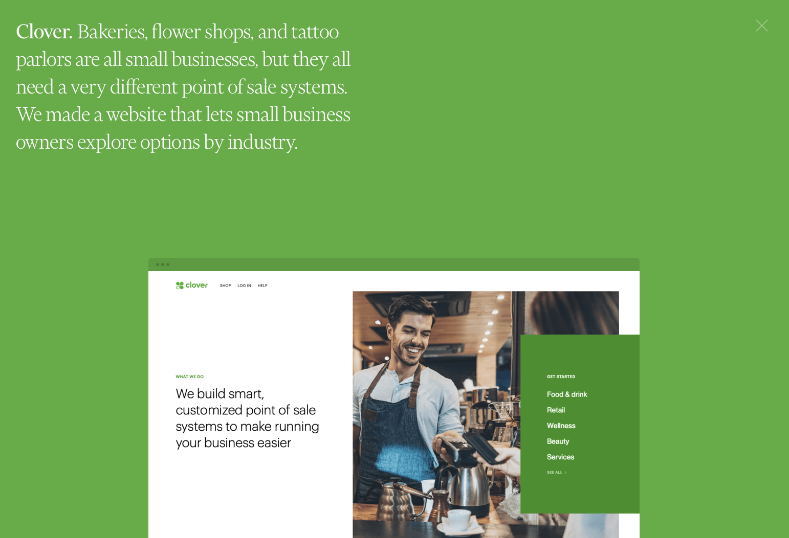
Then think to yourself… What do I want a recruiter or potential client to know about this project? On doing this, you’d extract from the case study formula what made it most successful and valuable to you!
Remember: People don’t have time. Keep it short, different, and value-packed.
4. Showcasing the fundamentals of design.
Your portfolio is a design asset in itself. Spacing, colors, typography are all important to show off. And like your designs. Go outside of the box to make your portfolio stand out of the pack!
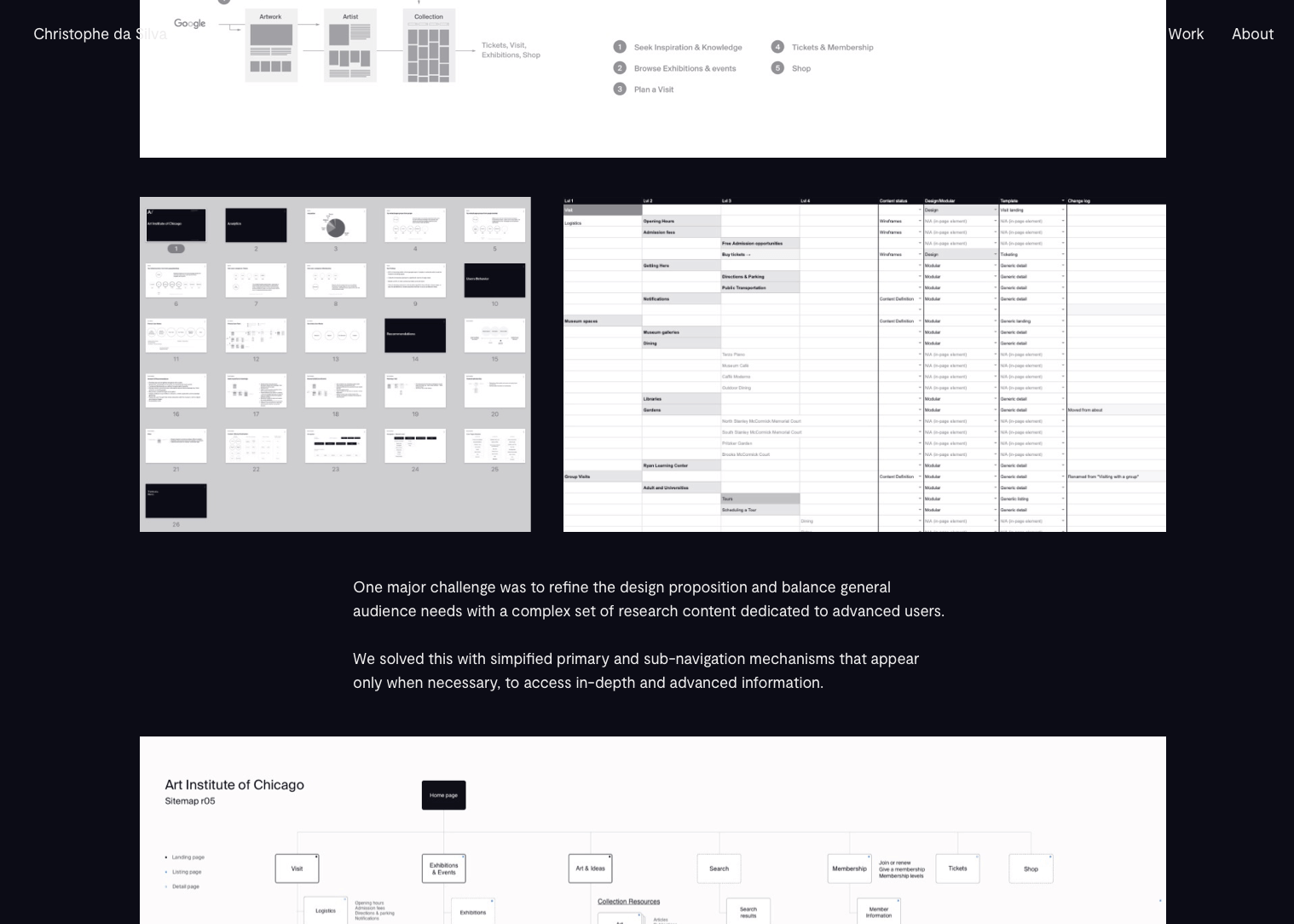
Bonus tip: Include design exploration and research in case studies to show how you landed on ideas along with complete user journeys.
5. Let your visuals do the heavy-lifting
People scan the quality of your images in seconds to decide if your portfolio is worth digging into. Your portfolio mockups should be beautiful, big, and loud and make your entire portfolio flow. The biggest turn-off is low quality, bad matching images, that make you look like an amateur.
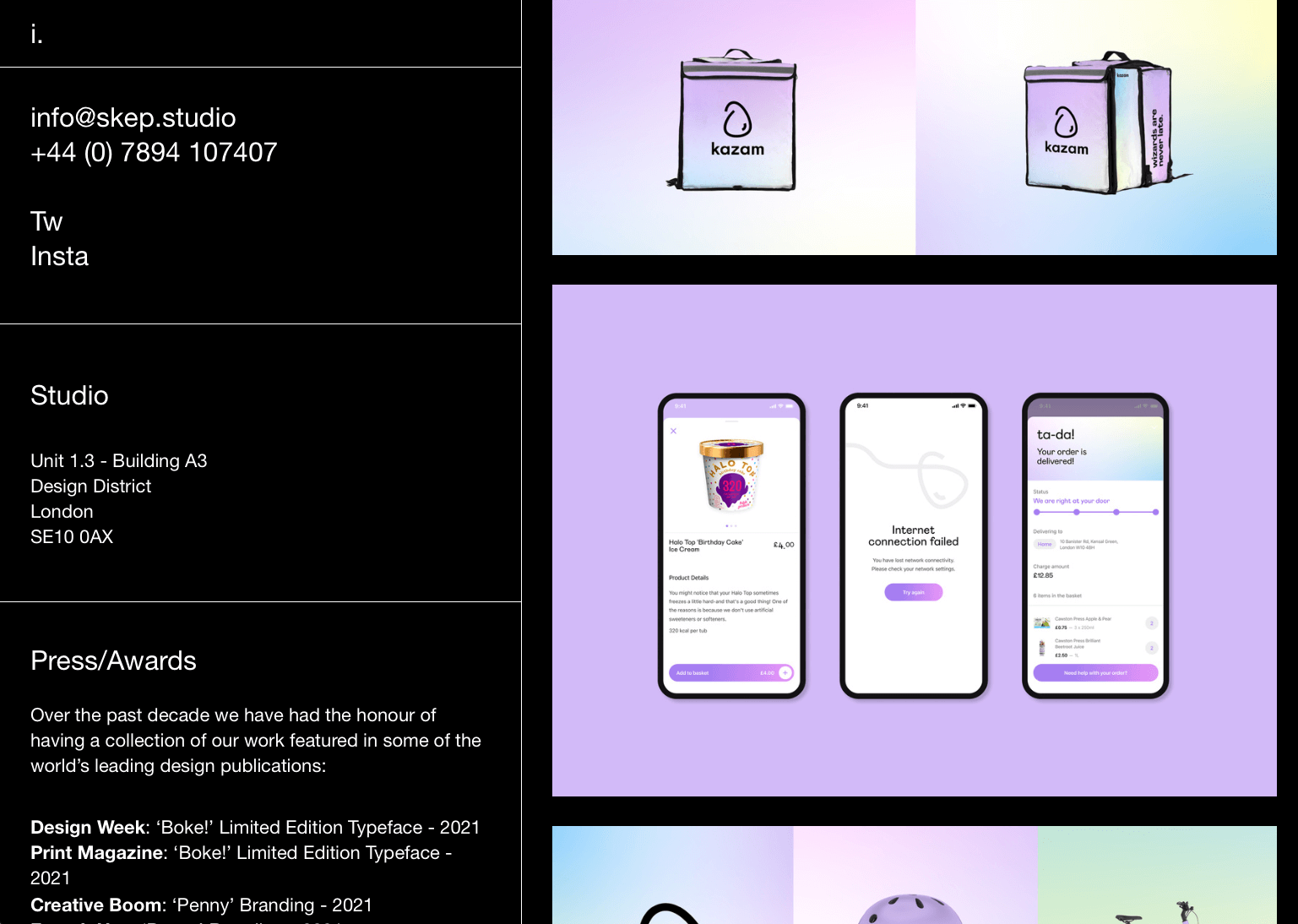
The easiest way to stand out is to use UX portfolio mockups and builders. This way, you make sure it all looks congruent and professional!
Tools and mockups to make your UX portfolio with ease
Best UX portfolio mockups for 2023 to grab attention and land gigs.
Dealing with Photoshop templates to create your portfolio is a pain. It takes time and finding mockups that work and you might end up having to pay for one-off templates before you’ve even tried them.
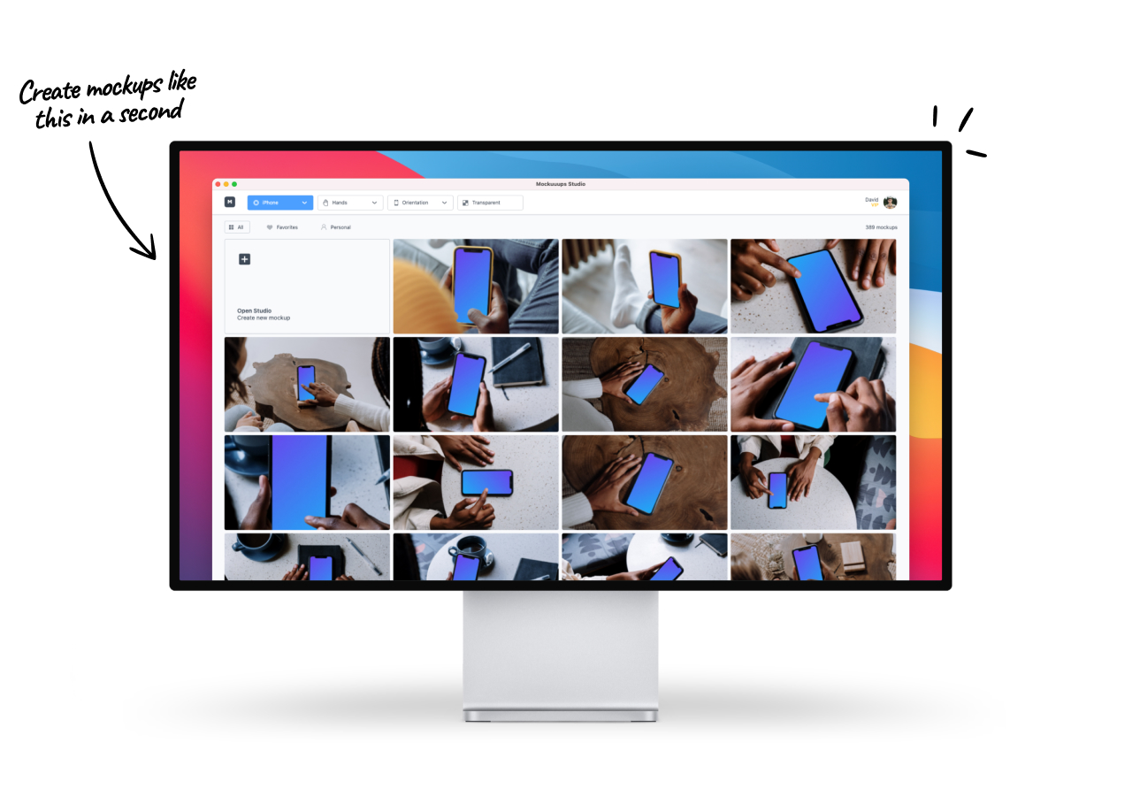
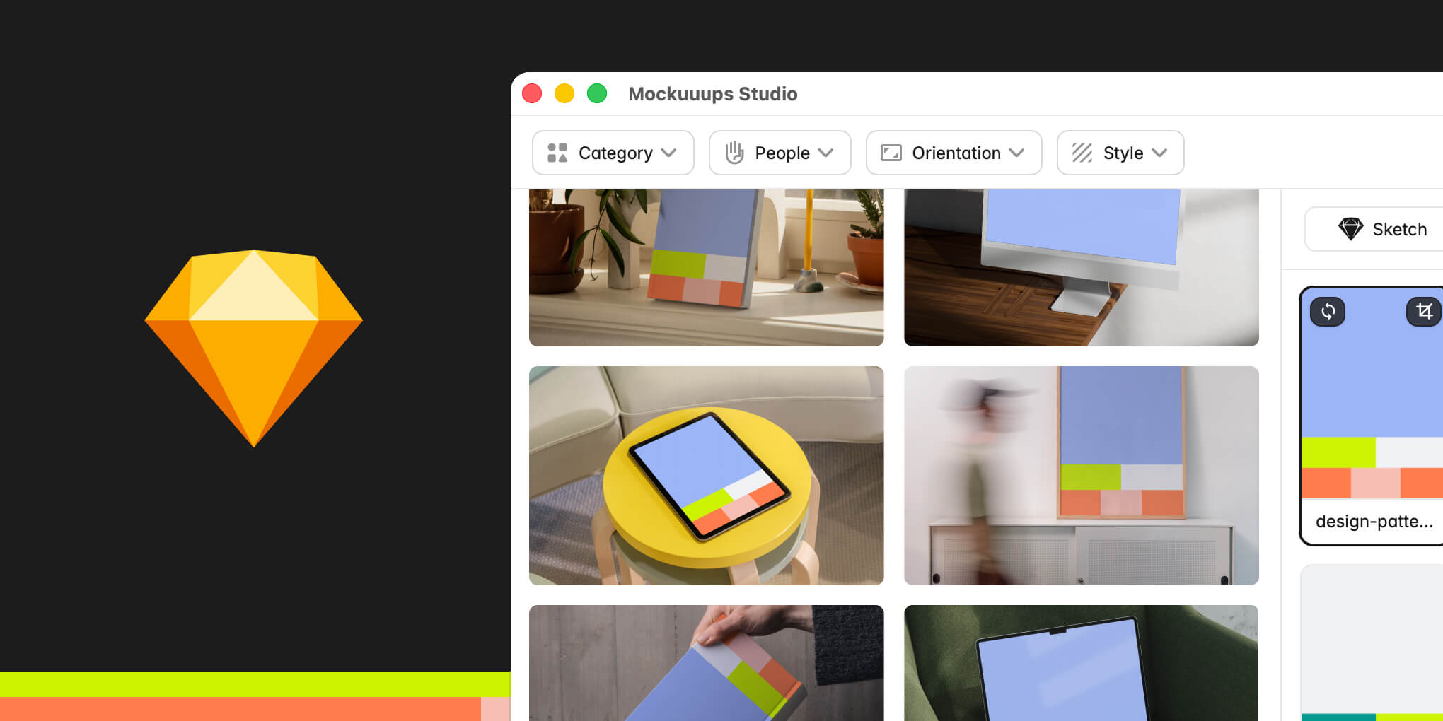
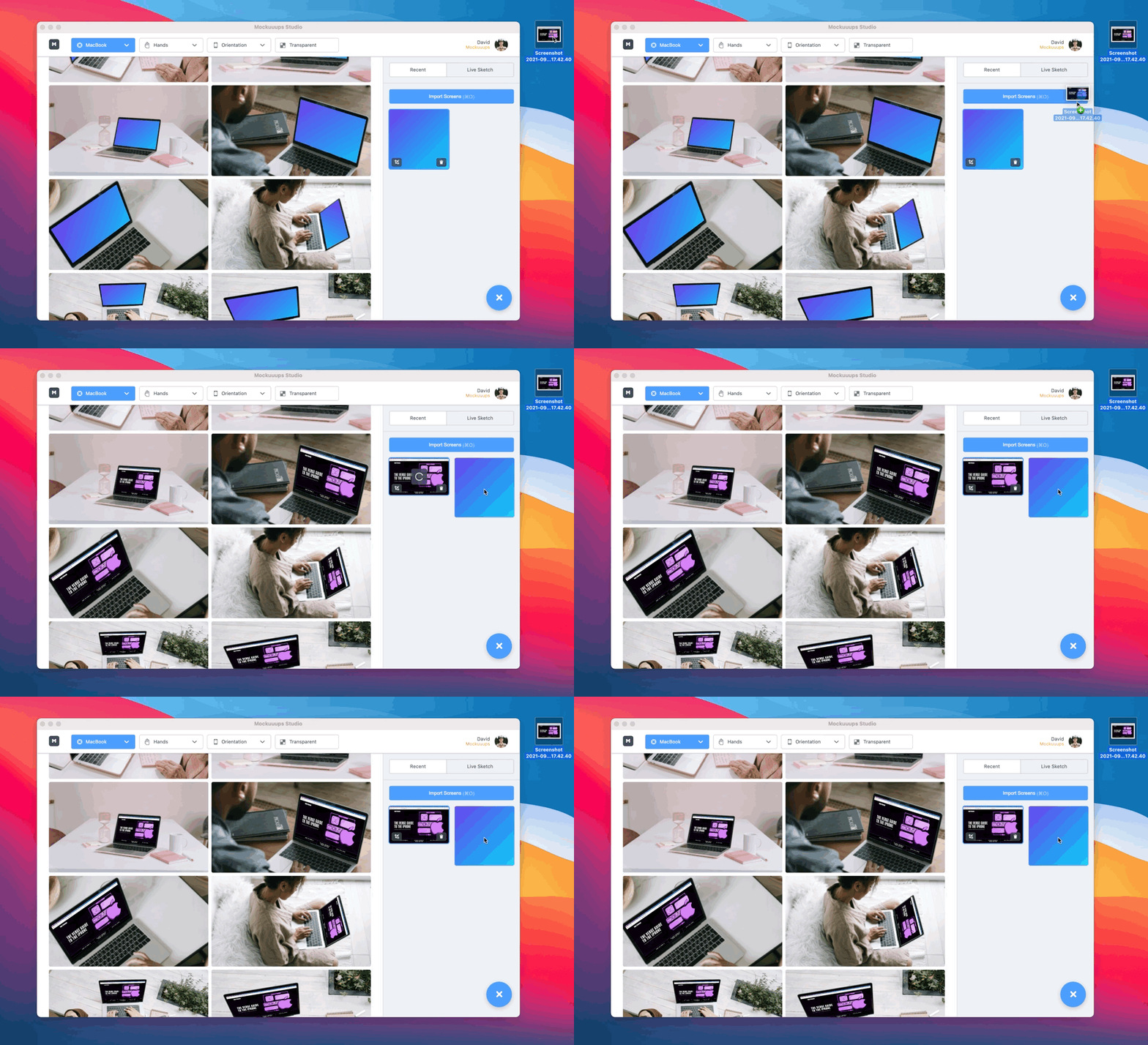
Mockuuups Studio lets you drag and drop your UX portfolio visuals to 1300+ mockups for FREE up to 8K in resolution with automatic formatting. So you’ll never have to worry about pixelated visuals again and get visuals of all sizes in seconds!
Here’s how it works...
Ready to take your portfolio to the next level? Generate over 3200+ UX portfolio mockups for free.
Best UX portfolio creation tools
The ideal UX portfolio should be stunning, shareable, and interactive. Freepik offers a large collection of images and videos that you can use in your UX portfolio. You can also use the filters on their website to find the perfect image for your needs. Additionally, there are a couple of fantastic tools to shortcut the painful process and help structure case studies for you:
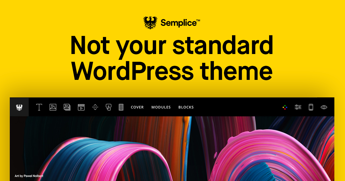
Portfolio website builder - Semplice
Semplice lets you create a website portfolio on your own domain. Made specifically for designers... "It’s where the designers you admire come to build their portfolio.” ...or so they say!
We’d have to agree. It’s worth checking out if you’re thinking about creating a website portfolio of your own!
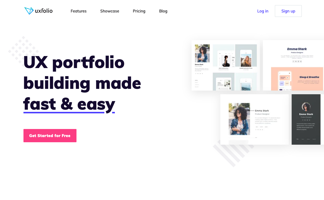
Interactive UX portfolio builder - UXFolio
Uxfolio is for UX portfolios specifically. With pre-built templates, case studies, and even the ability to embed prototypes it sure looks powerful.
Their mission is for UX designers to stop taking a print or photography approach to UX portfolios and make them interactive. Check them out right here.
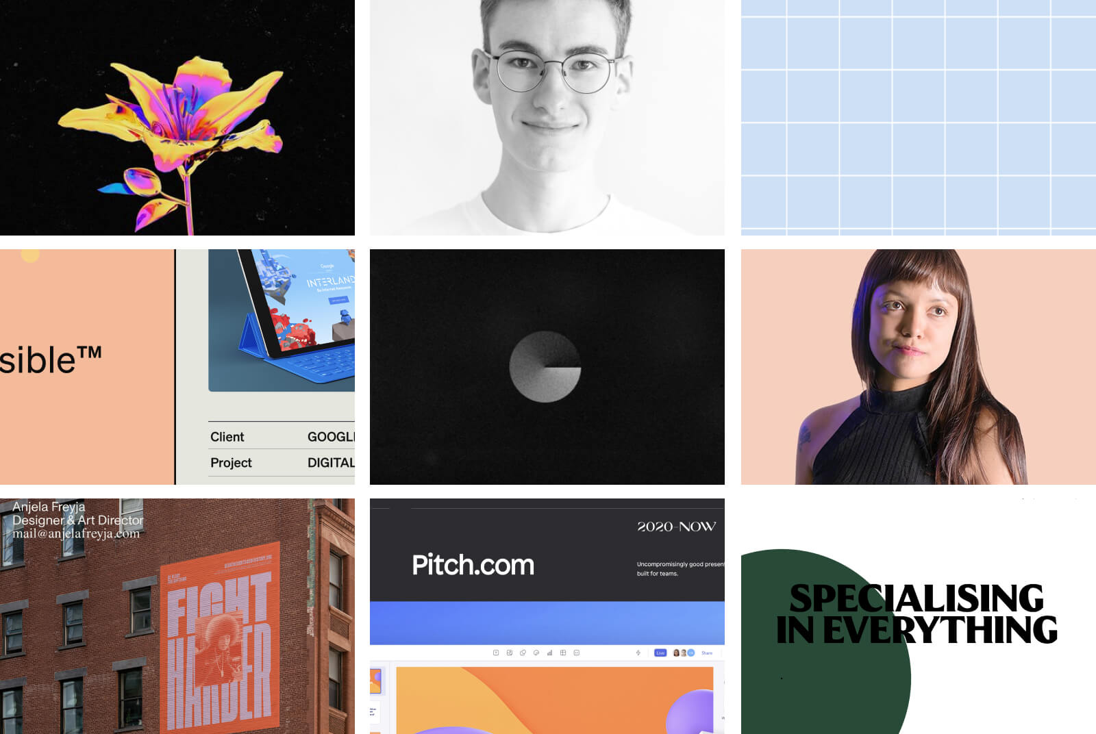
A curation of the best portfolios to inspire you!
Good design thrives off great ideas. Take a look at Semplice’s best portfolios of the year and Michael Filipiuk’s collection for inspiration…
