SKURT iOS App UX Revision
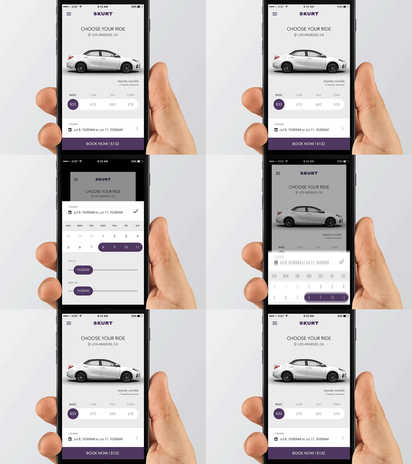
Last year we helped the fine folks at SKURT as UX consultants. This was one of the experiments with their booking flow. Animation made in After Effects.
What we were trying to solve:
1 - make a cleaner look and feel (it was too dark before)
2 - reduce the number of steps to make a booking
3 - make the "pick a car" screen the first screen the user sees.
You can check the old version here.
View on DribbbleYou may find inspiring…
Sign in or create an account
New or returning users? Get started here.
Forgot your password? Reset here
By continuing, you agree with the Terms of Use and the Privacy Policy.
