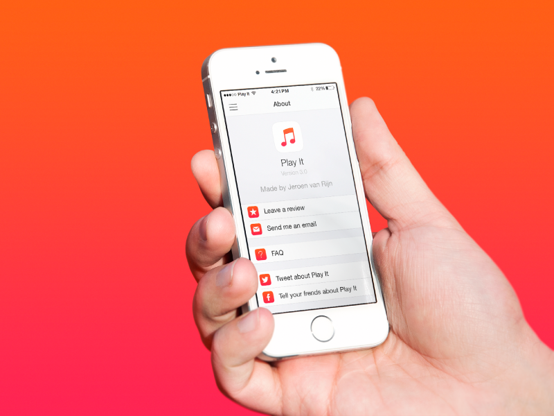
Play It - icon & about page
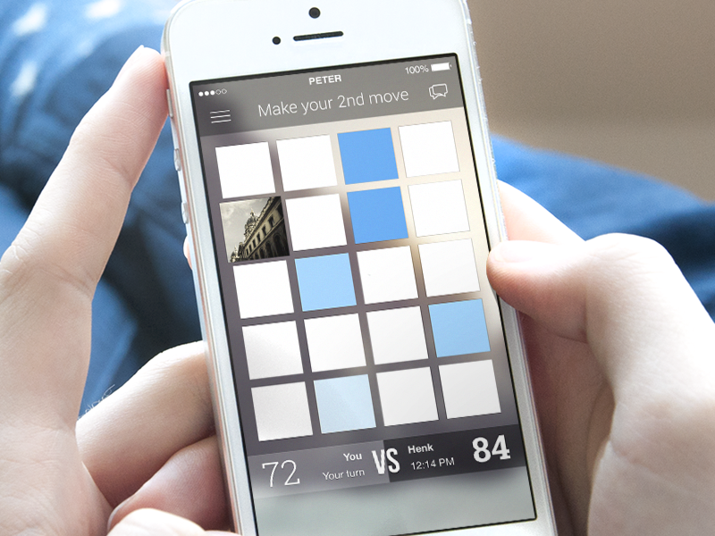
This is the new about page and icon I designed for Play It. I wanted to design a new icon which was in line with the flat style of iOS 7. I chose to remove the old blue color and replace it with a orange/red color, because there are already a lot of apps with a blue icon. I made the background of the icon white, because it's a clear color which is in line with the new design of the app.
What do you think?
Mockups made by Mockuuups.com
View on DribbbleYou may find inspiring…
Sign in or create an account
New or returning users? Get started here.
Forgot your password? Reset here
By continuing, you agree with the Terms of Use and the Privacy Policy.
